Making my font smarter
My blog used to use Crimson Pro as the main body font, something that threads the needle of being serif-y enough for the Possession-esque posts, but not too out of place for the technical macOS Messages debugging ones. 1 Though admittedly this is in the eye of the beholder. You should consider customizing anything you use, and the font is no exception. Let's tweak it!
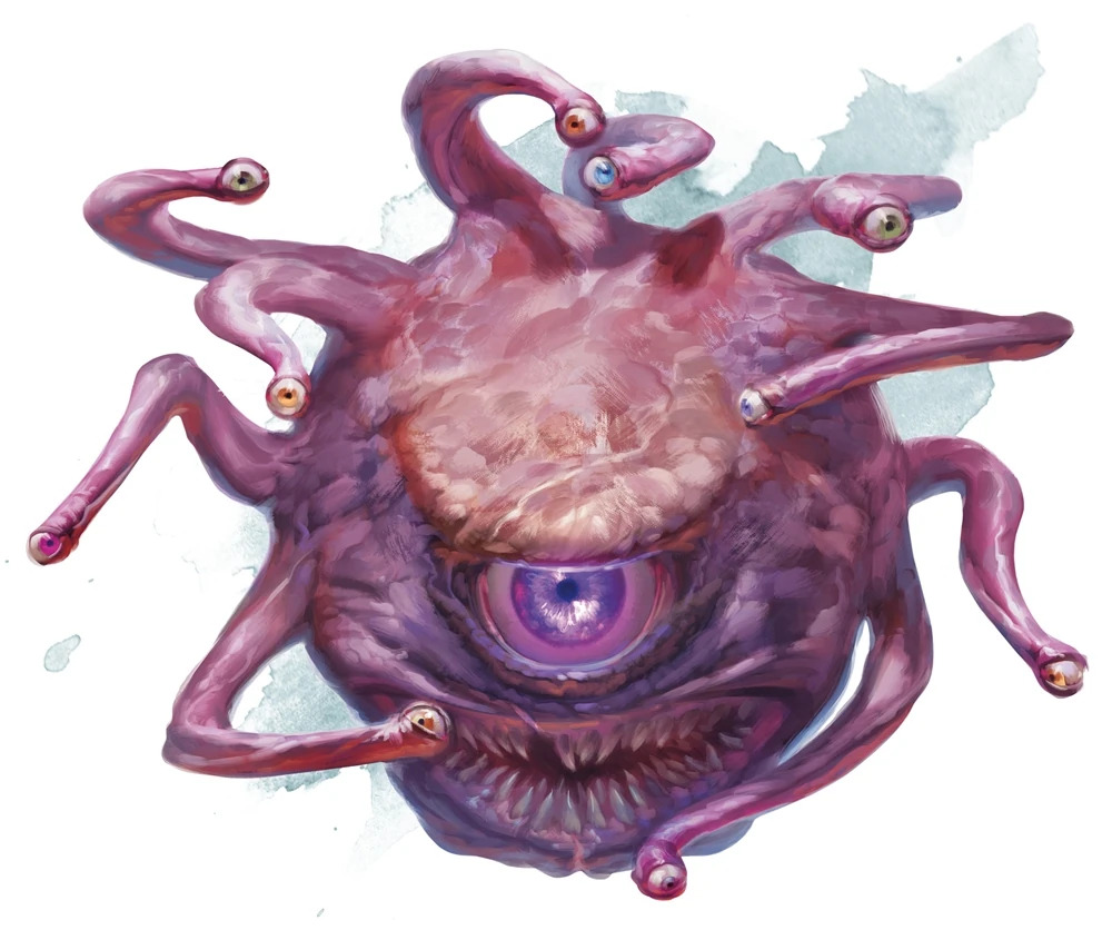
Straight quotes
The first thing that bugged me was the "straight quotes", 2 Straight/dumb, in comparison to curly/smart. which were overly thick and always grabbed my attention when I saw them. Even in contractions like isn't I found the apostrophe sporadically distracting. 3 This is a 'me' problem, but after all so is the blog.
Using the fonttools Python library we can load the coordinates that define the glyphs, scale them horizontally (here to 80%), and offset back to the same midpoint. And voila, they're "much" thinner!
Smart quotes
We can do better than this. We could use the smart quote characters in the font, which are slimmer and more stylish. But because they're different characters it's annoying to manually type them in, and I want copying from the blog to use normal
4
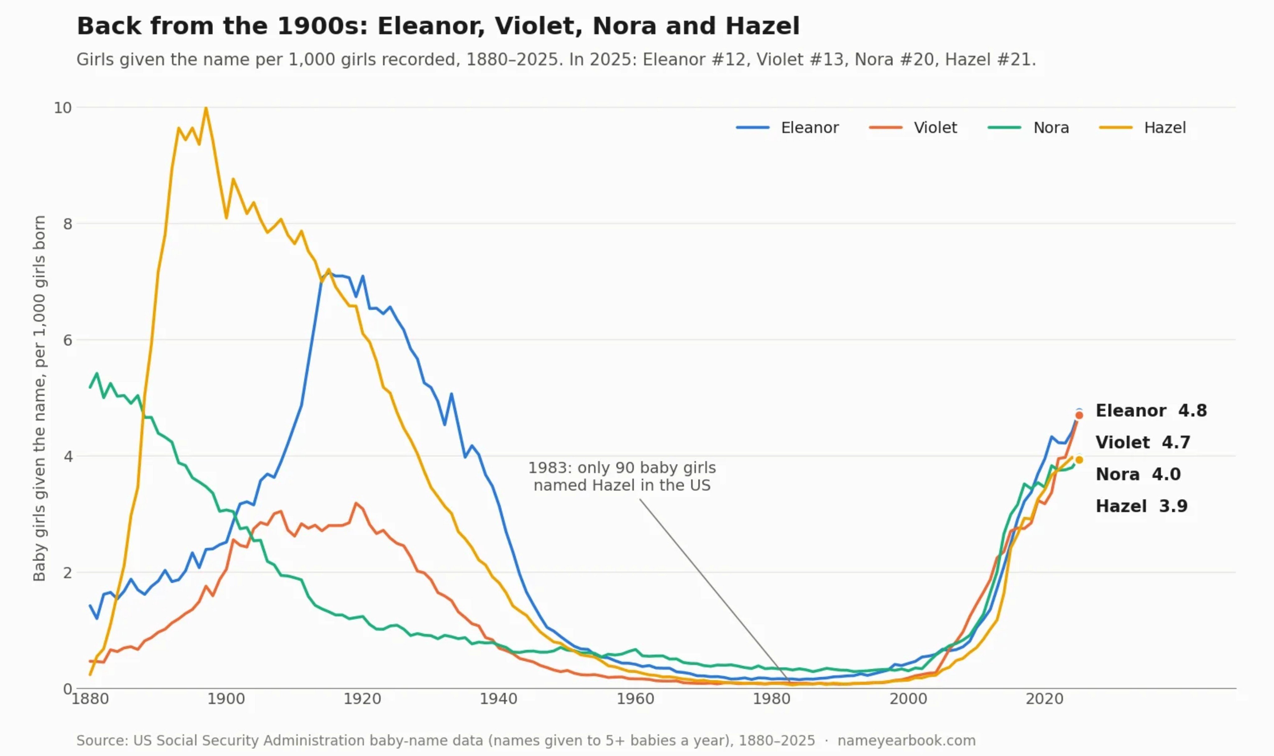
It's exhausting, having a constant desire to quote The Incredibles. But I did it 3 months ago so I'll hold off here. Instead, here's a fun chart about a surge of people naming their kids Violet.
 quotes.
Luckily fonts have to handle things like ligatures (turning fi into fi) or Arabic joining (ب rendering as ﺐ in كتب but ﺑ in بيت and ﺒ in كبير) which means they have to be pretty smart.
5
Fonts are Turing complete, allowing you to do insane things like render text as QR codes using only a font.
We can take advantage of this with the "contextual alternates" feature (or calt for short) to render " as “ at the start of a quotation without changing the character.
6
Huge shoutout to Conrad Irwin's blog which gave me the idea.
Using the same fonttools library we can bake in handling for contractions like isn’t and ‘single’ or “double” quotes, while leaving standalone ' apostrophes and heights like 6'3" alone.
Rare characters
I’m also trying to introduce some decorative characters as delimiters into the blog, specifically 𐫱 from the Manicheaen script.
7
The Manichaean punctuation fleuron, which I wrote about in a previous snippet.
Unsurprisingly for characters from a religion that collapsed in the 3rd century AD, a lot of computers can’t render it, showing the dreaded ‘tofu’ block.
8
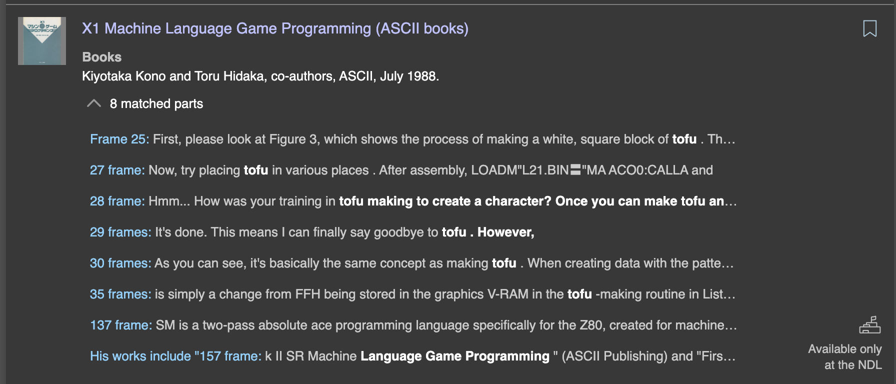
The ‘tofu’ nickname comes from Japan (because it looks like a block of tofu). Proving who coined it (or when) is a little tricky because the relevant Japanese archives require in-person access—the earliest English reference I could find is from 2000, but there are typographic references in Japanese from 1994 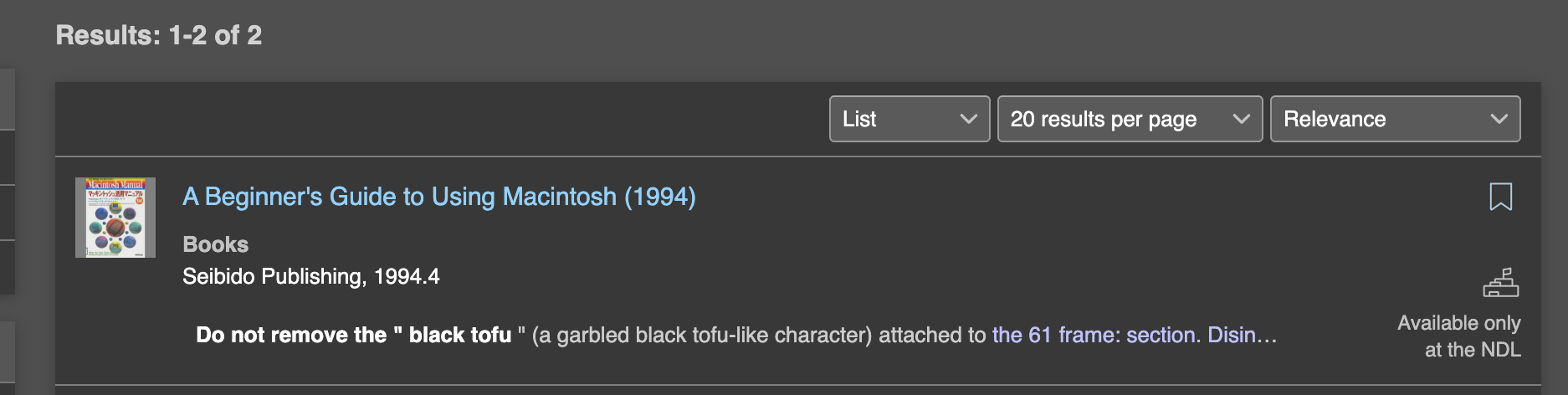 and some game-programming documents that use the same term in 1988.
  The Noto Sans Manichaean
9
Noto for “No Tofu”.
font renders it properly, so ideally we could grab just that character.
The Noto Sans Manichaean
9
Noto for “No Tofu”.
font renders it properly, so ideally we could grab just that character.
Young Adult fiction
And finally, I just love Goudy’s diamond-style periods—I fell in love with them when I was ~10 reading Eragon and I'd like to include them in an ode to my childhood self. I'm not going to carry the design language through all of the characters that use dots (I want the i and j to stay the same), but ideally I would Frankenstein it onto the punctuation. Unfortunately Goudy is a proprietary font, but luckily the heavily-inspired Sorts Mill Goudy is under the SIL Open Font License, so we can steal borrow from that!
Those changes were more involved (we need to extract portions of characters and copy them over while maintaining spacing) but here are the results! 10 The font's been changing throughout this post as the changes were made, though it's pretty hard to notice. This one's mostly for me :D. Look at those diamond emoji eyes though?! Click the buttons to see how these characters render in Sorts Mill Goudy, the old Crimson Pro, and the new Frankenstein-d version.
Normally doing this would have required me to pore over feature calt specs to define the sub blocks for when to switch quotes. I'd have to open the font in a visual editor to shrink the 'dumb' quotes and carefully graft the dots onto the question mark and period. I'd have to copy over the 𐫱 fleuron from the Noto font. Instead Ï can do it with an AI in five minutes. The only thing left for me to do is rename it, and while the resulting product is almost entirely Crimson Pro, my blog is much more green than red—welcome Viridian Pro.
-
Though admittedly this is in the eye of the beholder. ↩︎
-
Straight/dumb, in comparison to curly/smart. ↩︎
-
This is a 'me' problem, but after all so is the blog. ↩︎
-
It's exhausting, having a constant desire to quote The Incredibles. But I did it 3 months ago so I'll hold off here. Instead, here's a fun chart about a surge of people naming their kids Violet.
↩︎ -
Fonts are Turing complete, allowing you to do insane things like render text as QR codes using only a font. ↩︎
-
Huge shoutout to Conrad Irwin's blog which gave me the idea. ↩︎
-
The Manichaean punctuation fleuron, which I wrote about in a previous snippet. ↩︎
-
The ‘tofu’ nickname comes from Japan (because it looks like a block of tofu). Proving who coined it (or when) is a little tricky because the relevant Japanese archives require in-person access—the earliest English reference I could find is from 2000, but there are typographic references in Japanese from 1994
and some game-programming documents that use the same term in 1988. ↩︎ -
Noto for “No Tofu”. ↩︎
-
The font's been changing throughout this post as the changes were made, though it's pretty hard to notice. This one's mostly for me :D. Look at those diamond emoji eyes though?! ↩︎