Tracking down the movie poster for Possession
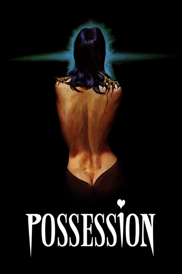
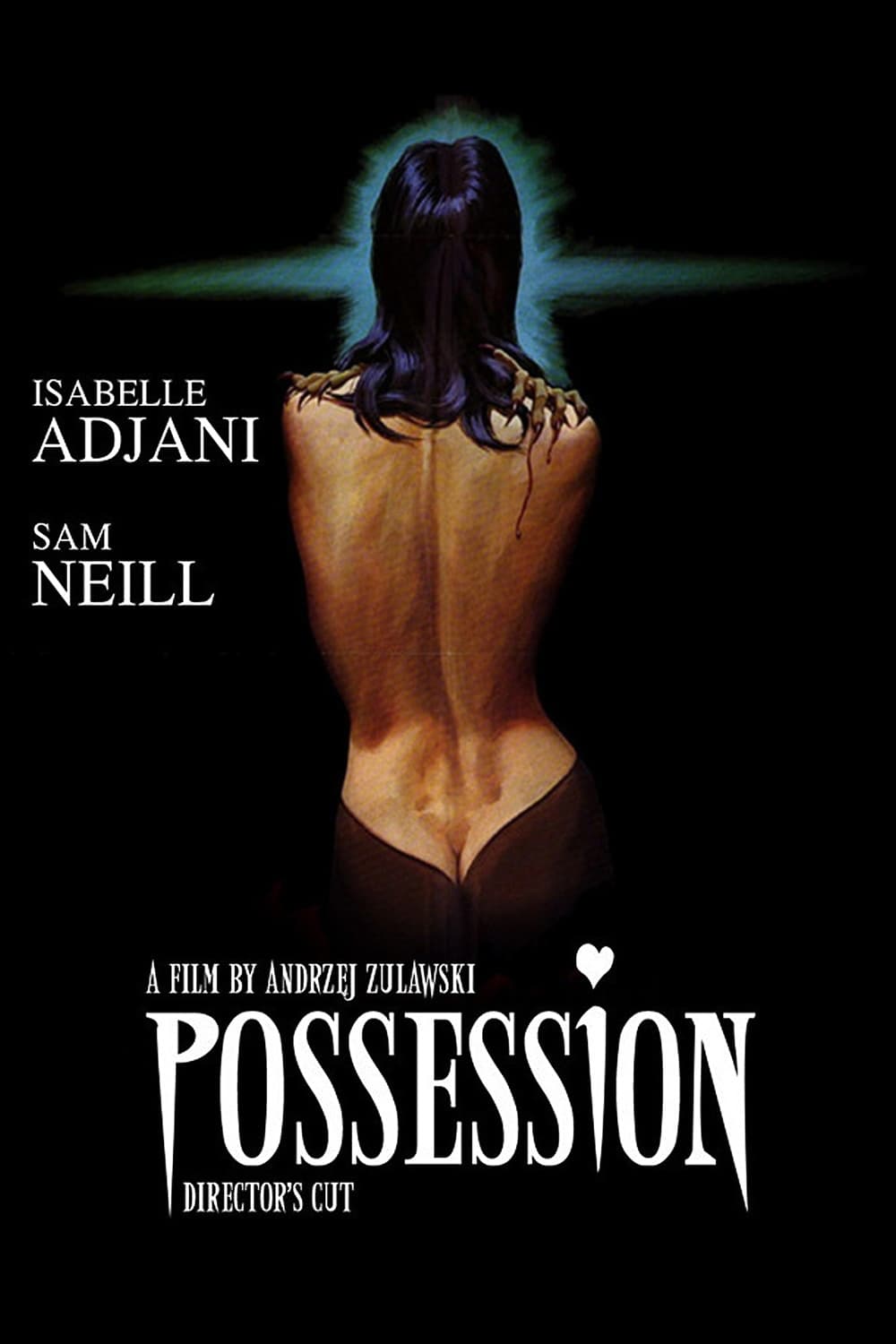
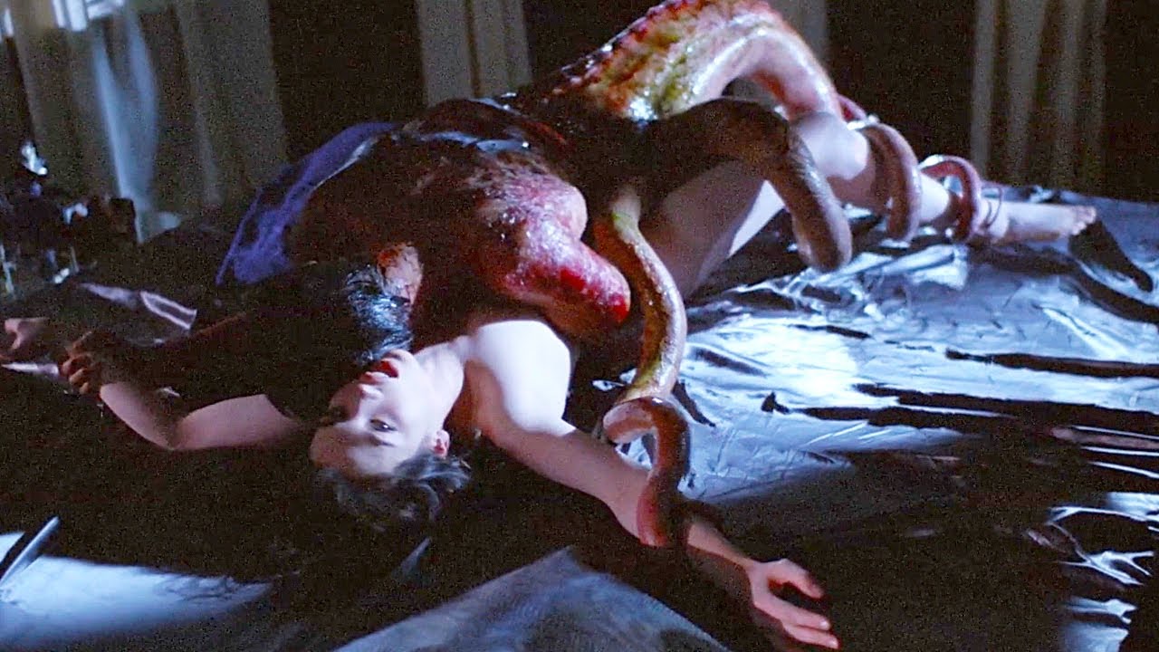
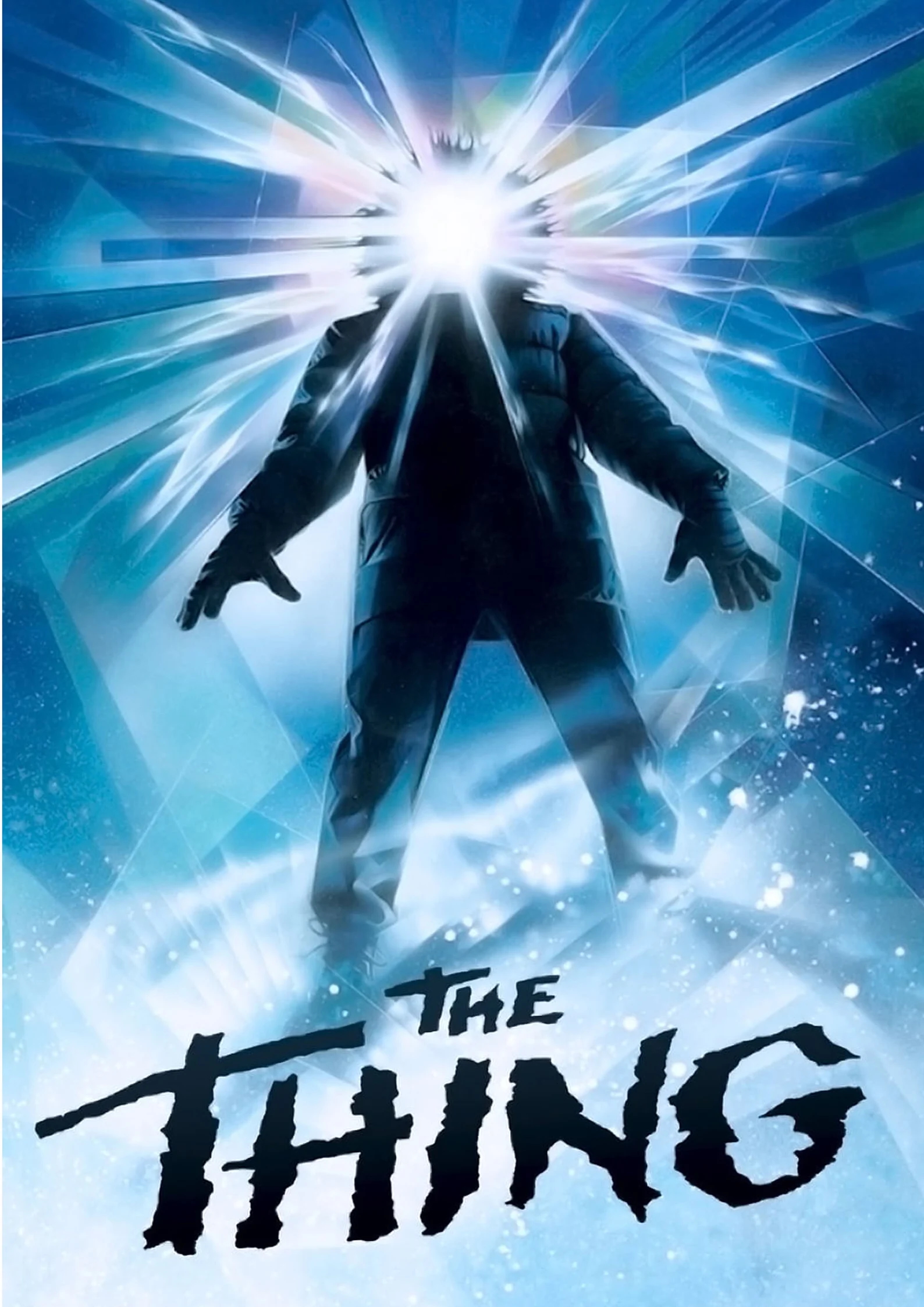
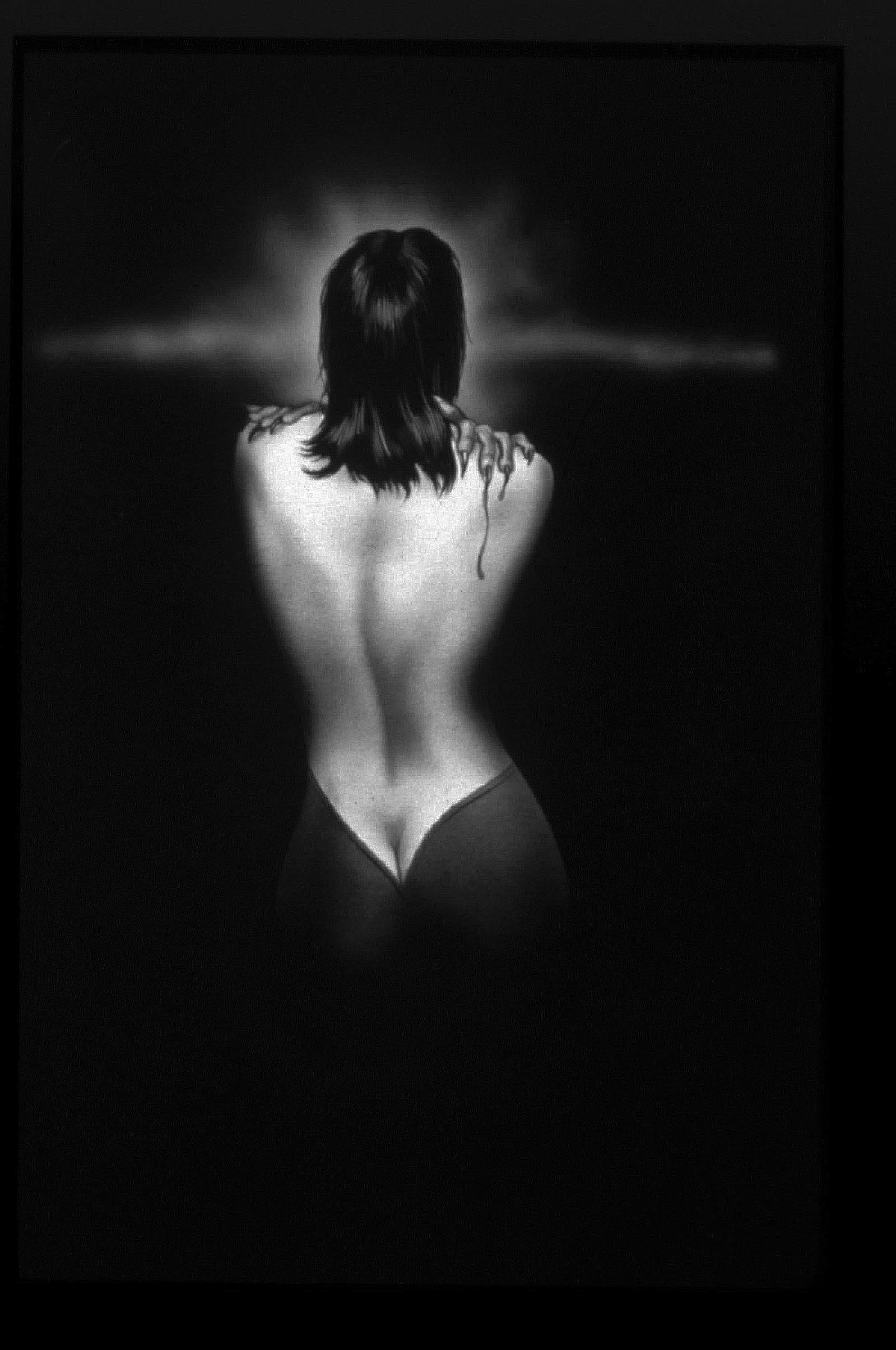
I recently watched the 1981 movie Possession by Andrzej Żuławski. 1 And reviewed it on Letterboxd, give me a follow! It's a weird movie, ostensibly horror, but primarily used as a lens for the dissolution of the director's marriage (and political commentary). 2 Also for the record it's not just weird, given that it's on Sight and Sound's Greatest Films of All Time list. However the default poster on Letterboxd is explicitly horror focused (claws gripping into a woman’s back, 3 This is because (spoiler) she has sex with a tentacle monster (NSFW). And as a fun fact Carlo Rombaldi, the guy who helped make that happen, also did the special effects for Alien and E.T. blood trickling down, and bright blue spikes like something out of The Thing poster). I was curious about why they went with this and tried to look up some details on the poster — thus began the rabbit hole. Come along with me on a two day hyperfixation through the history of Possession and its artwork! 4 Or fine, skip to the answer.
The French Poster
I started off by just searching for "Possession poster". Rather than bring up the above image though, this mostly just returns the more common poster the film had for its original release at Cannes.
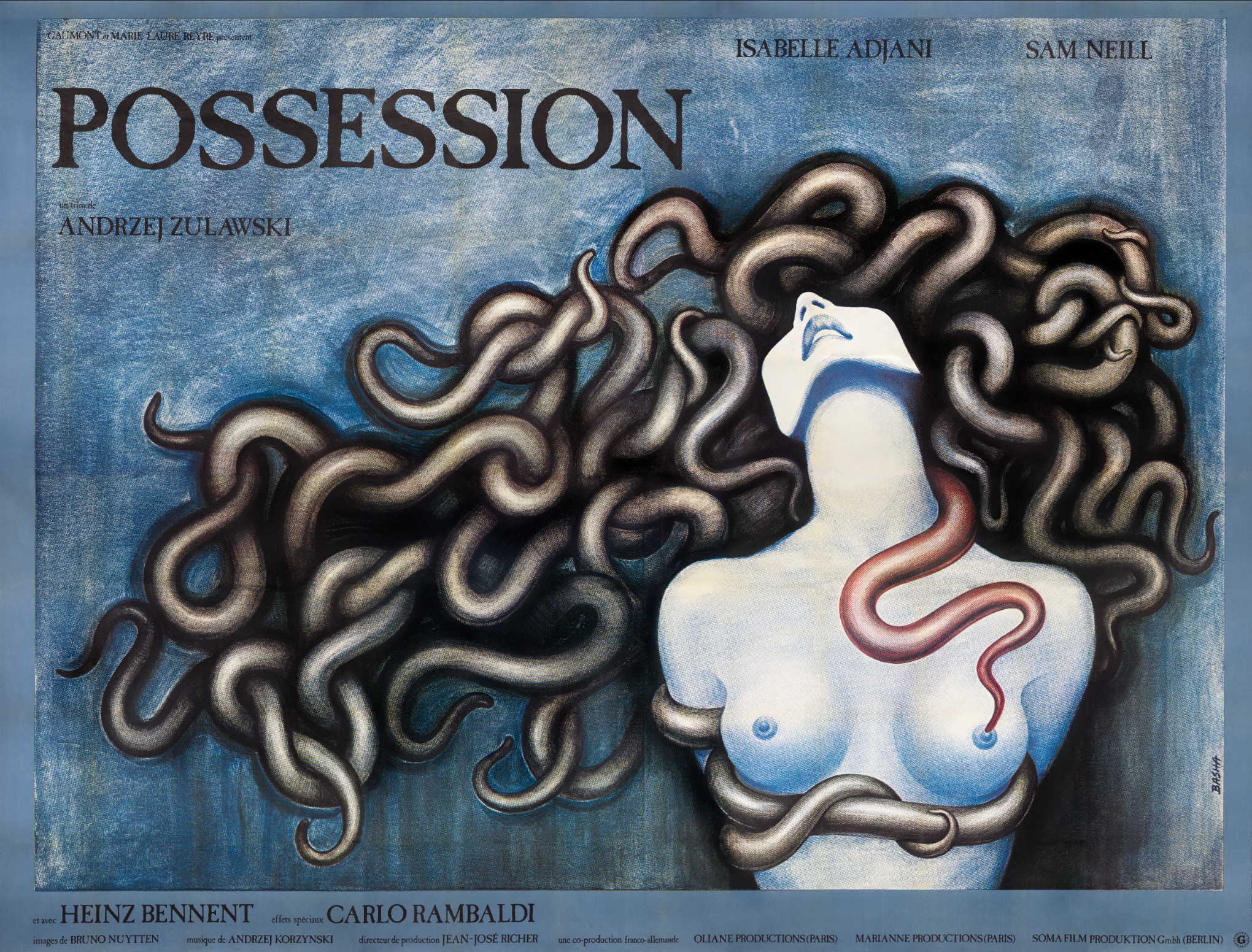
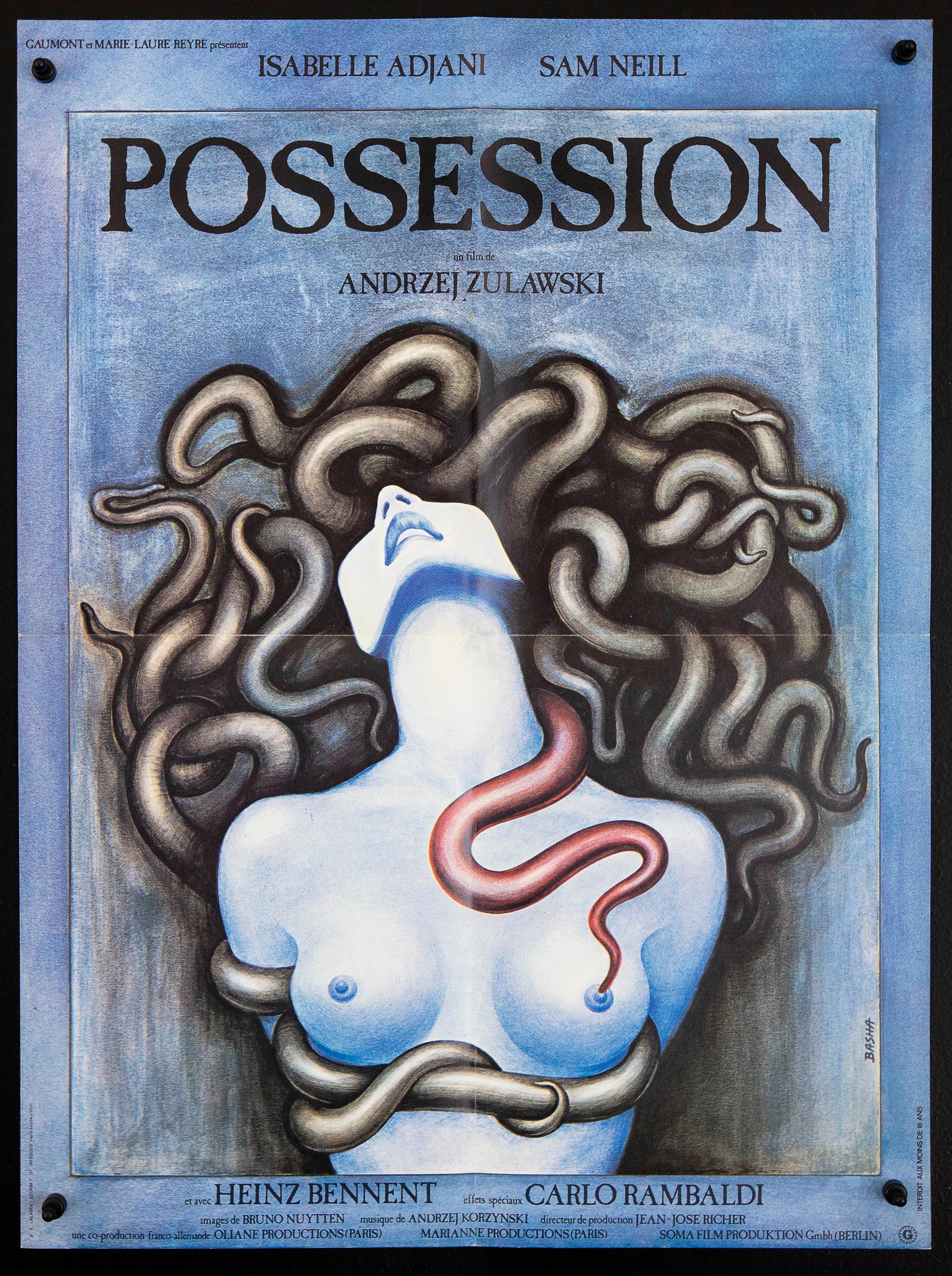 Original French poster
 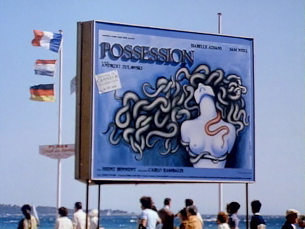 Wide billboard of the poster at Cannes (or in HD)
This version of the poster has much better attribution: it's designed 5 And signed, "Basha" vertically in the bottom right of the image. She also sometimes used "Basia" and "Bacha" as a signature, making crediting harder. by Barbara Baranowska. She's a Polish artist who did a number of book covers and movie posters in the '60s and '70s, with the poster for Possession near the end of her career. 6 Interestingly enough Barbara was briefly married to Żuławski, though she did the poster in 1981 over a decade after their split (and while married instead to the original financier of the movie). It's possible that this inspired the love triangle in the movie—it was reportedly a little messy. While information is still pretty sparse, the documentarian and film restorationist Daniel Bird (director of The Other Side of the Wall: The Making of Possession and the driving force behind a lot of the Żuławski rereleases) curated a show of her work, directed a short documentary about it, 7 Which was later released as a featurette for a 4K version of the movie. and wrote an in-depth article that provides most of the online English information I could find about her.
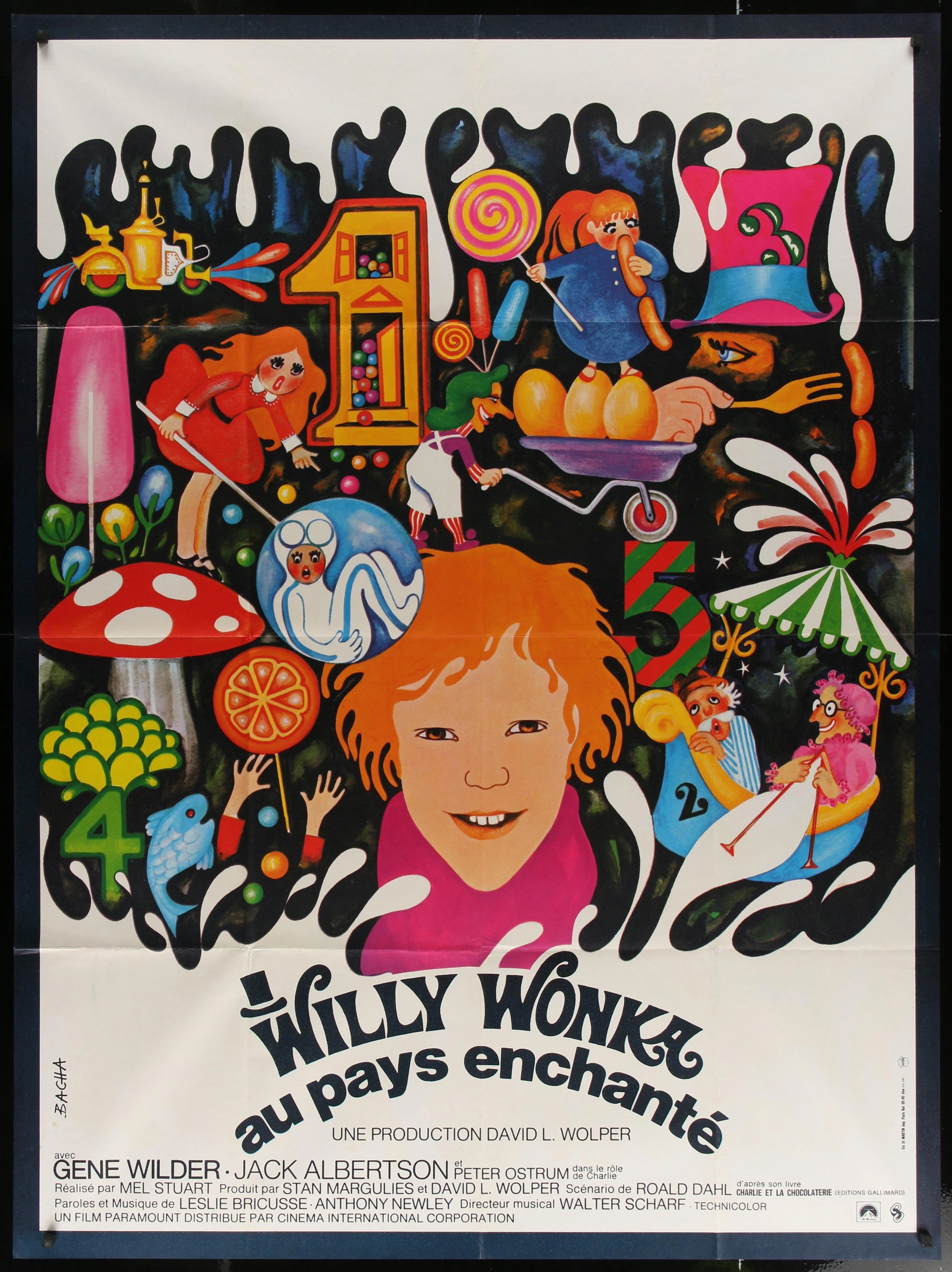
She has a sizeable catalog (some of which you can see in this collection collated as part of a podcast episode tackling her 8 I'm a fan of her French Willy Wonka poster personally, which is enchantingly unsettling. And for the record so is the podcast, which somehow runs for 30 minutes before they talk about her. ) but this poster is by far her most well-known work, buoyed by it remaining the cover for all of the more recent 4K releases from Umbrella and Mondo Vision. But if Barbara's poster was the original and is also used for new rereleases, where does the Letterboxd poster come from?
Censorship
To answer that we first have to get to take a detour into Żuławski's history with censorship. His second feature film, The Devil (1972) was banned by the Polish government for the film's themes of "political dissent and hedonism",
9
An excerpt from an interview he did (the whole thing is a fun read): "So I wanted to tell this story but obviously I couldn't say it with the Polish government's money. So I put it under the masks and costumes of the 18th Century, when several tragedies annihilated Poland and the situation was about the same . . . When they saw the film they called the Minister of Culture in the Soviet Union at the time; she came from Moscow to view the film. They said to her, 'We suspect that this is something not really about the 18th Century but we are not so sure' (laughs) . . . For 18 years the film was like a legend, in jail."
leading him to leave communist Poland for Paris. After receiving critical acclaim for The Most Important Thing (1975) the Polish government reconsidered, inviting him back to Poland where he worked on On the Silver Globe (1988)
10
Technically a 1988 movie as Żuławski came back and later completed it, but timeline-wise he started in 1976.
— until that too was blocked by the Polish government, who revoked their support, forcibly halted production, destroyed the props and discarded official copies of the reels.
This dislike for the censorship of communism and the divide between the West and the East is a throughline of Possession and something that was constantly on Andrzej's mind (and one of the reasons why the English movie was produced in Europe). In a May 1981 interview at Cannes he said
"I have to say that the producer was very serious about the idea of making a European film, therefore a film that is beyond American control. You know that American control is terrible because the producers have all the rights, the notion of the artist and of the director doesn’t exist if your editing doesn’t satisfy them . . ."
This ended up being a cruel twist of irony. After a limited theatrical run Possession was banned on VHS in the United Kingdom as one of the 72 'video nasties' forbidden under the Obscene Publications Act for a tendency to "deprave and corrupt". 11 Who doesn't love a good moral panic! At least there's nothing like this going on in the US right now. When it came to the US it was even worse, with Andrzej's producer "conned into some bad deal with some American idiots". As Frederic Tuten, the cowriter on Possession, put it in a 2014 podcast 12 The podcast also has an interview with Daniel Bird who had a great story about Żuławski from when he was at a film market where [2:13:11] "he was expected to pitch [his project] and he very politely refused to pitch it saying that look, if you can say what your film’s about in 10 minutes, don't bother making it, you know, really just say it in 10 minutes and do something else . . . If you can sell it to either an investor or an audience, there's really no point in making the film because basically everything else, the 90 minutes extra, is just padding.".
[1:09:00] "And then it came to America . . . I had to sign a paper that I would agree to edits for the American viewing. And my producer Marie-Laure . . . she wrote to me, she called me. She said, look, would you please sign these papers releasing us to make these cuts? . . . And she said, please do it. . . . It's important to us because we want the film to be seen in America.
Little did I know that they cut almost 40 minutes from the film. They just cut out the heart of the film and they wanted to make it a horror film. They just wanted to make it a horror film about Adjani and this monster and they opened it here, I think on Halloween. I mean, that tells you everything."
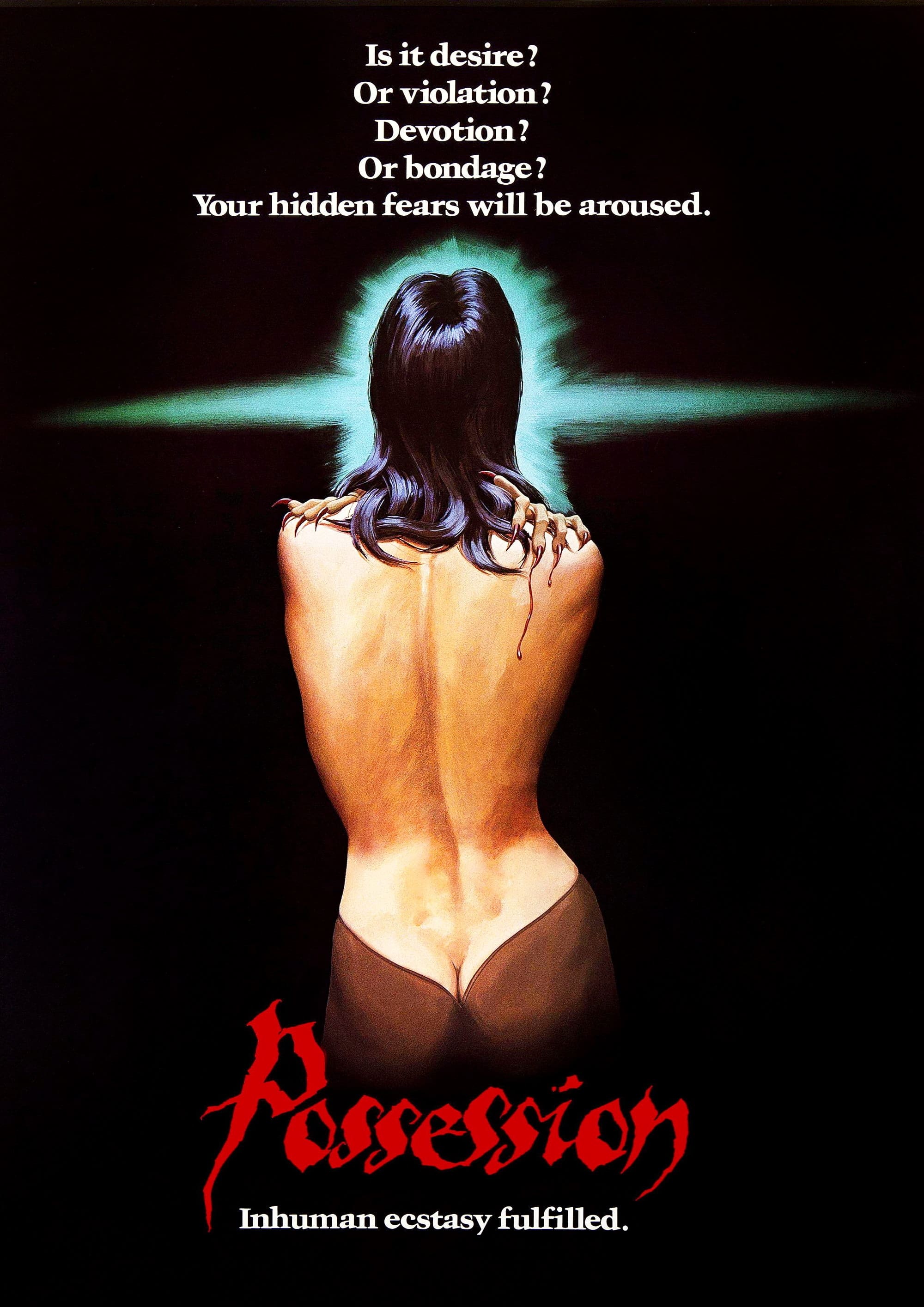
And with this we rejoin the original quest. It's 1983, an American company 13 We'll come back to them. has just purchased the rights to attempt to contort Possession into a boilerplate Halloween horror film, and they need a film poster. They can't go with Basha's 'high-brow' cover because frontal nudity might offend the sensitive American audiences in their thirst for blood. They need something that screams "horror"—and what could be better than a monster sinking its claws into a helpless girl!
The American Poster
Letterboxd posters all come from TMDb so we can browse through to find alternate covers and versions (though we have to be careful because they're user-submitted and often include fan creations 14 Technically they're not allowed unless they're stripped down versions of official posters, but in practice stuff gets through. ). There are four main posters that use the same base painting of the woman.
Ideally we would find sources for these images and inspect the dates to be able to sequence them in time. My a priori suspicion is that the original cover we were looking at (the first cover) is a stripped down version of the second one made custom for Letterboxd, with the fourth poster as the main source for the painting. Let’s find out!
Director's Cut (Black)
The only hard references I could find for the black Director's Cut version was this image from a 2010 blog post.
While there's a reference to Possession's first U.S. DVD release being ironically billed as the 'Director's Cut', given the lack of distribution details, copyrights, and dates on the back cover I suspect that this one is fan-made. There are some Ebay listings for DVDs with this cover but none of the images are of a real physical product or show the back. 15 Also they're going for $16 and are "brand new", so they are almost definitely just people selling illegally burned disks. Additionally the only physical version I could find a picture of online was someone who bought it from Ebay and it looks like a quick adhoc print job: if this was broadly circulated there'd be more references to it (and expensive older versions on Ebay).
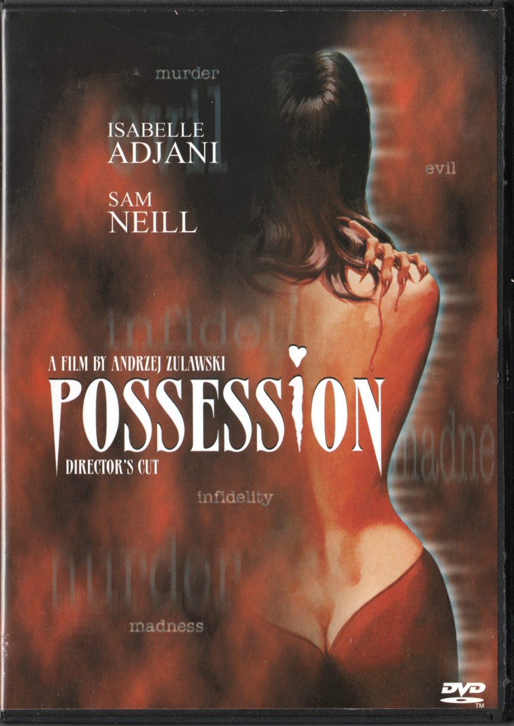
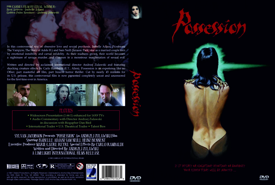
Director's Cut (Red)
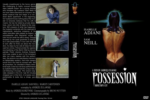
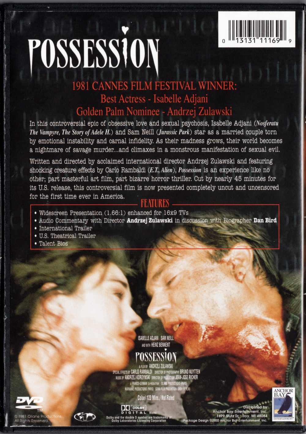
From the attribution in the bottom right back cover this is the Anchor Bay 2000 DVD release (the first time the original version was released in the US), and it's definitely real—there's screenshots from a blog, it's purchaseable on Amazon, and there's a 2002 import version of this from South Korea. 16 I wish I had the confidence to put a blurred lowercase "murder" in a gray typewriter font on a cover, they were truly innovating. And who needs a clear custom illustration when you have red fog! It also has the right font, so it's possible that the black cover is even an edit of this.
Miscellaneous Covers
I found two other covers from DVDcover.com, but both are uploaded by the same user with the same barcode so I think they're fan edits. 17 The red font used for the tagline seems too illegible for commercial use, and reverse image searching the inverted cross title doesn't bring anything else up (though it's a cool motif).
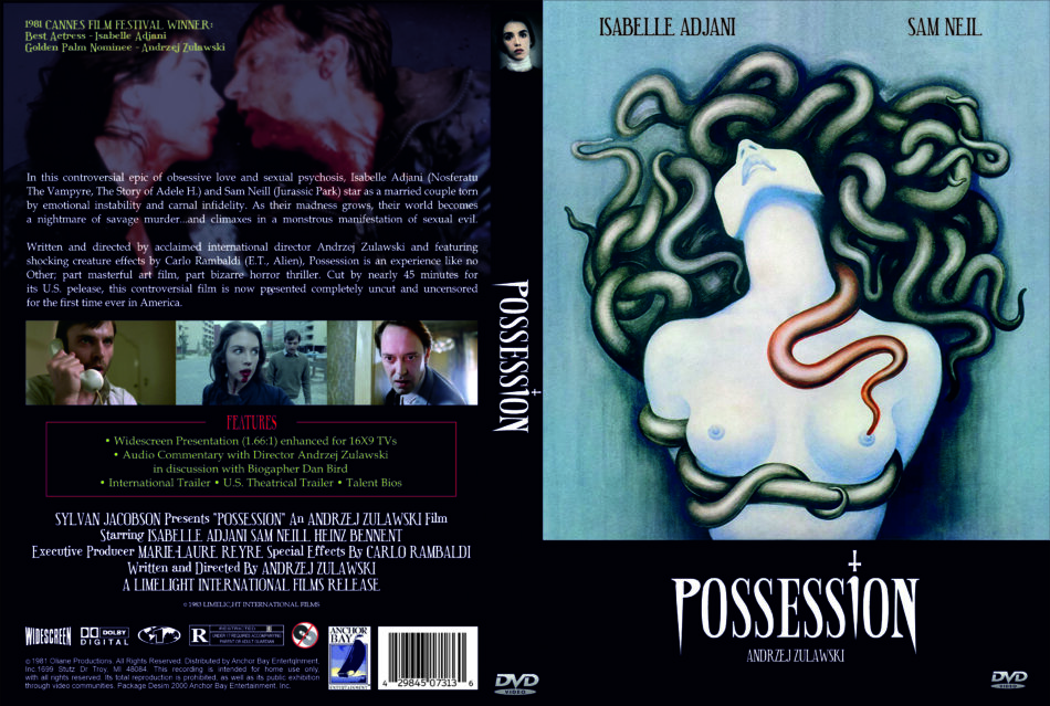
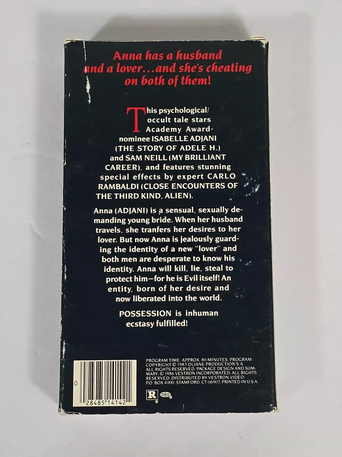
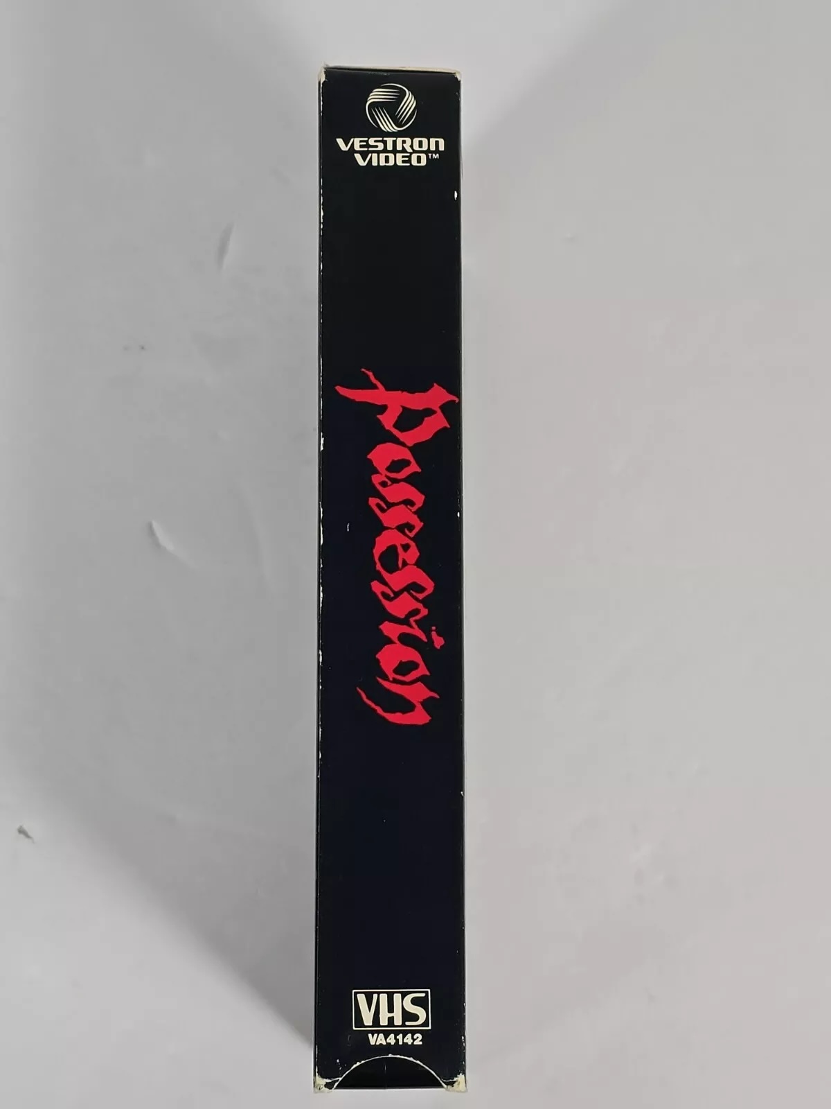
There's also a Vestron VHS from 1986 that's going for almost $300 on Ebay which is definitely real. It uses the same cover as the one I suspected as the original, so we're on the right track. Let's finally take a proper look at it.
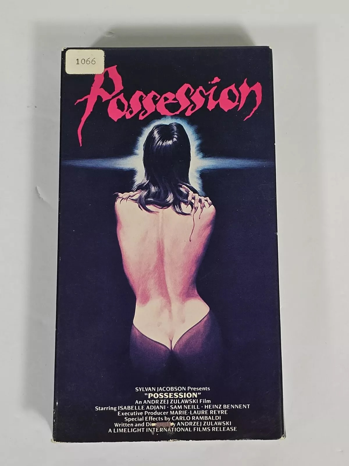
The Original American Poster
Reverse image searching that poster and scrubbing through a lot of versions finally gave me this scan from FILM/ART Gallery as the highest resolution. It also has © 1983 on it which is the earliest date we've seen.
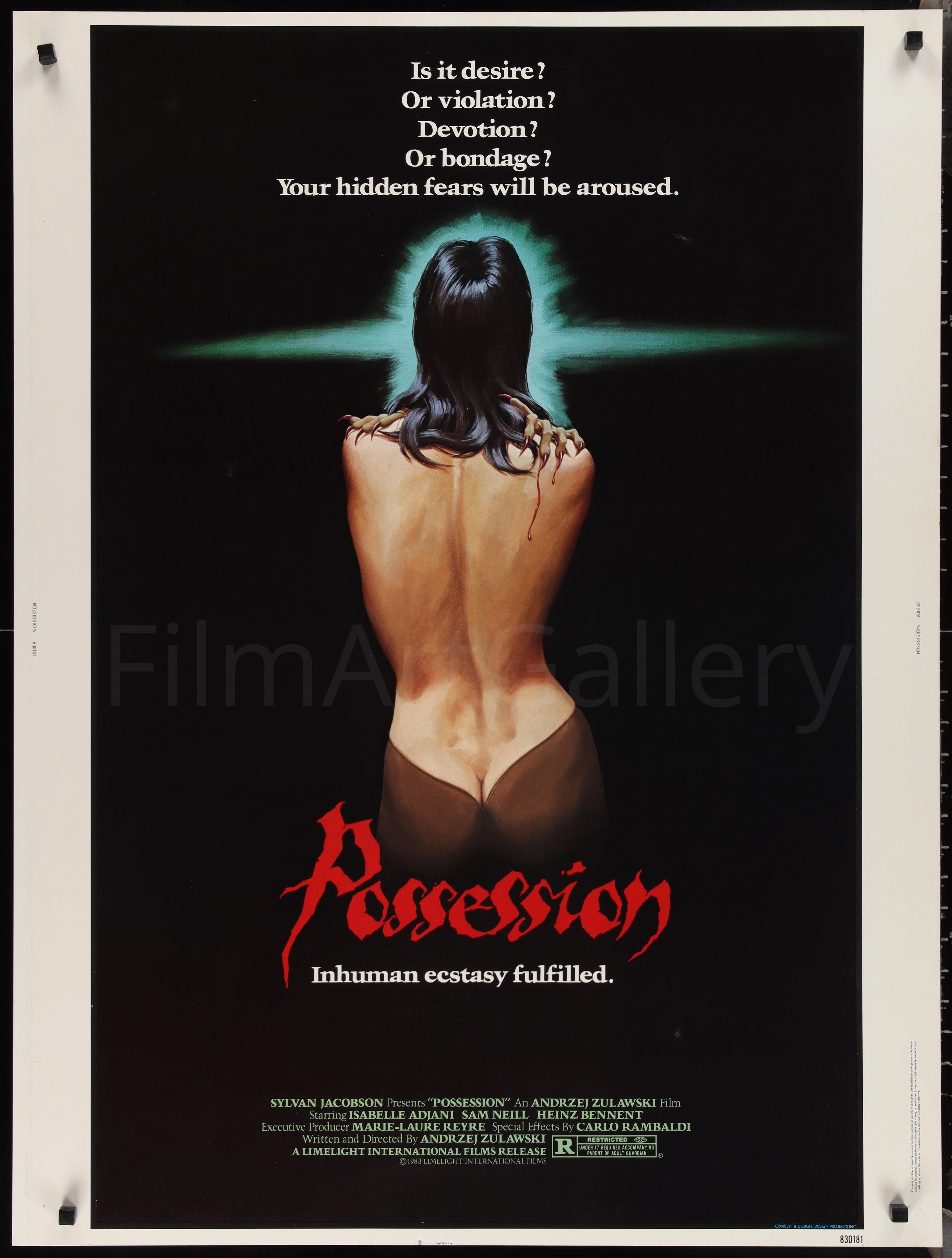
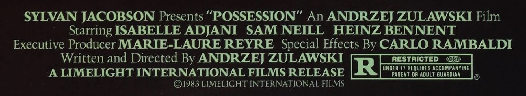
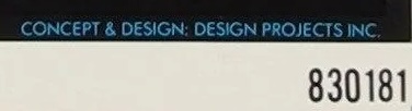
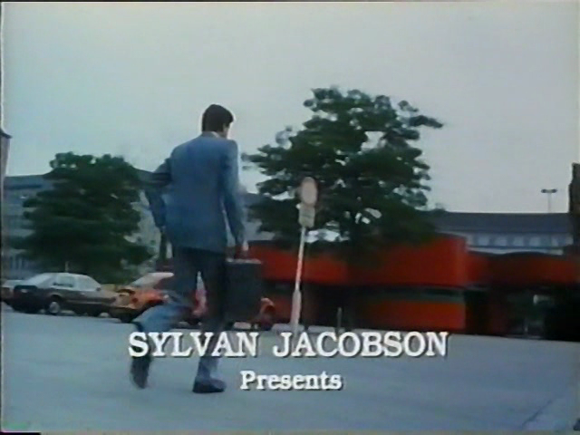
Zooming in on the bottom gives us a couple of things to further search for. "SYLVAN JACOBSON Presents" is unique to the US release and might be a lead. So is "Limelight International Films". And finally in the bottom right there's "Concept & Design: Design Projects Inc.".
Sylvan Jacobson
I couldn't find any good reference for who this is. There's two obituaries that reference the name, but the only reference in conjunction to Possession is an Off-White hoodie that references the poster. This might be a pseudonym, it may be one of these two people, but either way it feels like a dead end. 18 If you really want to follow this, here's my best thread.
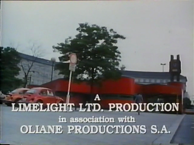
Limelight International Films
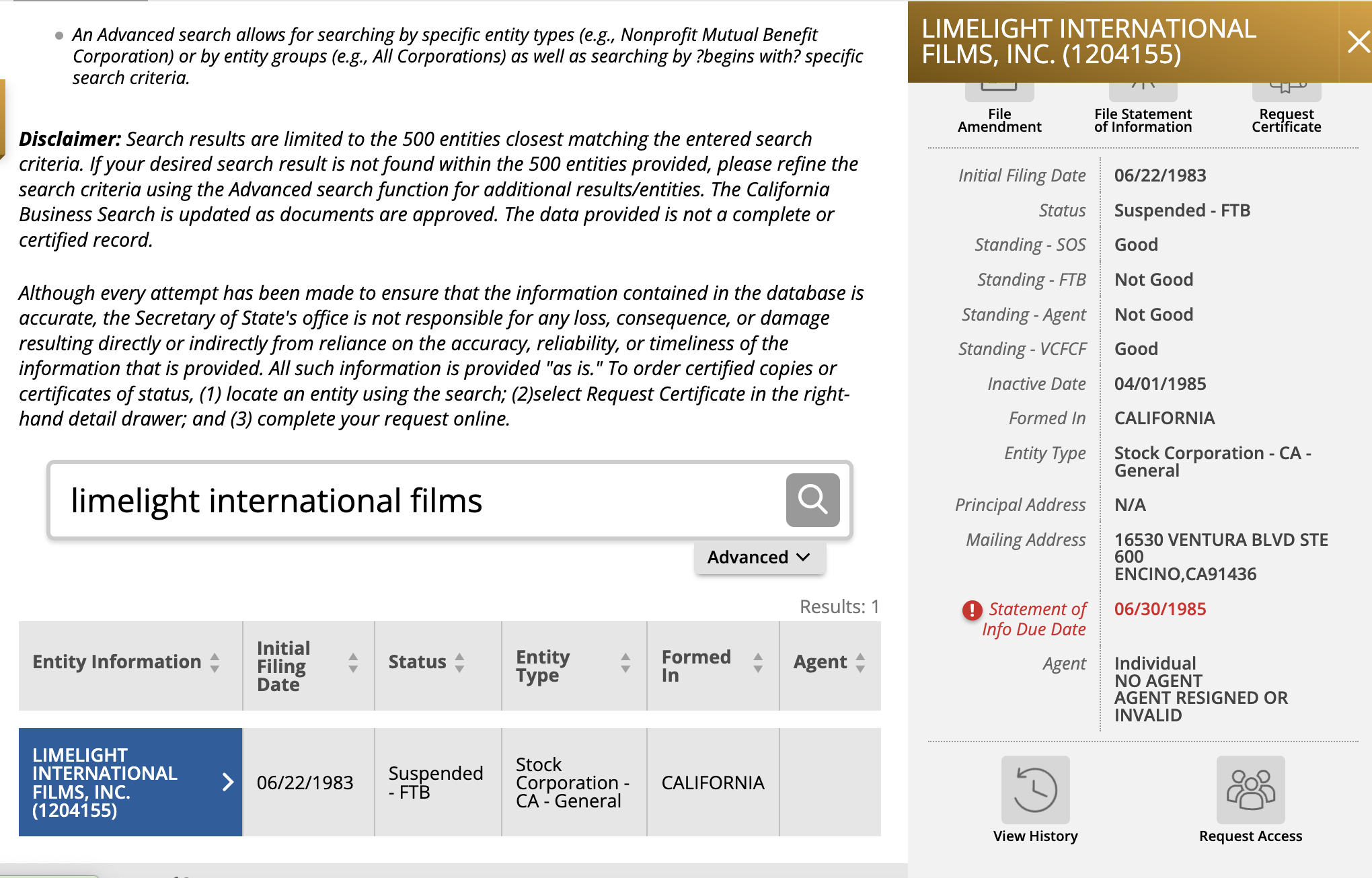
They didn’t seem to release other movies. Luckily as a US company they're forced to register a copyright. The trademark is associated with Vestron, Inc (which was the distributor for the VHS) but Vestron has since filed for bankruptcy and gone through multiple acquisitions, so that's not super helpful. But they're not just a US company—they're a CA company, so they're forced to register with the state.
Looking them up with https://bizfileonline.sos.ca.gov/search/business finds the company, but it was suspended less than 2 years after its initial filing.
You can request copies of the Articles of Incorporation for $10 online 19 There were a lot of points where I should have dropped this, but this was a real clear one in hindsight (*cough*) and they're all digitized so they're delivered immediately. The agent in question for the incorporation was Roger N. Golden. I gave him a call, and while he confirmed that this was him (he was in that address at that time) he didn't have records back that far and didn't remember the client, as this would have been a one-off request.
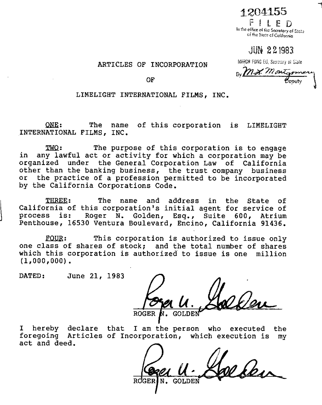 Articles of Incorporation
 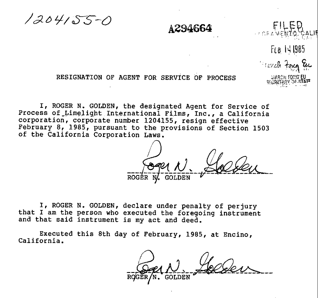 Article of Resignation
The only other reference I could find to Limelight from around this time was in the New York Times in a Sept 1982 article which mentioned executive producer Henry Weinstein 20 Rough last name for working in film production, but I think no relation. of Limelight International. He exists but I couldn't find anything else linking him to Limelight.
Finally just to confirm that the US cut didn't have any more details in the credits I scrubbed through the butchered release. It's available to watch here, but as a NYTimes reviewer who only watched this version put it at the time in 1983, it "makes no sense whatsoever", and there's no point in watching it (Żuławski said he never would). Regardless while the credits are modified, the information just matches what's on the main poster. 21 Oliane Productions seemed to shut down in 2008, but I doubt they'd have useful information by this point anyways.
They also changed the title to match the poster version, and along with it pretty much everything else (one of the later 4K releases included a 12m breakdown of the differences called Repossessed - The Re-Editing of Possession if you're curious).
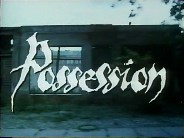 US release title
 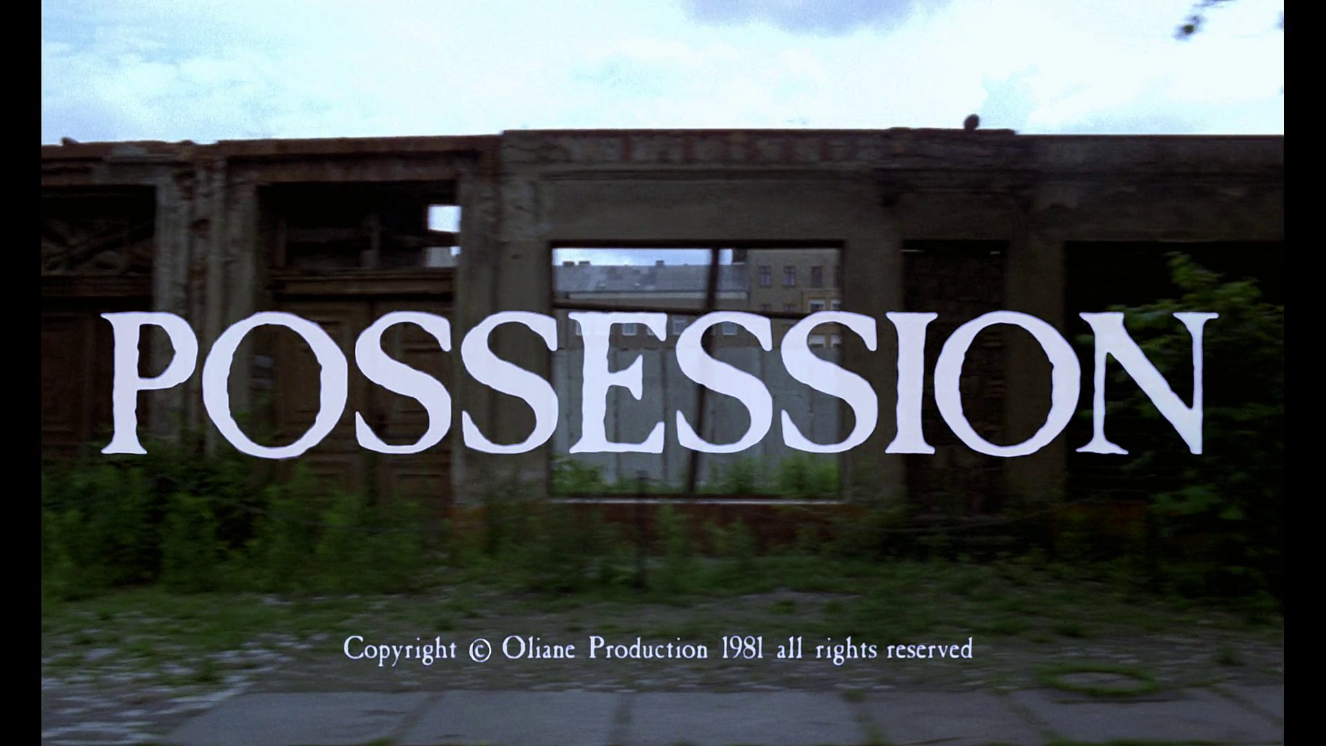 Original title
Design Projects Inc.
And finally we come to Design Projects! This is actually chronologically where I started investigating, but fleshing it out took the longest amount of time. Googling found a lot of irrelevant stuff but searching with "1983" gave a lone Wikipedia reference crediting them with designing the poster for the 1983 film Nightmares. It didn't have any additional information, but checking the Wikipedia history revealed that it was added by FilmVentures who also wrote this section for The House on Sorority Row (1982):
The one-sheet poster and advertising were created by Film Ventures International's regular advertising agency, Design Projects Incorporated. Design Project's owner, Rick Albert art directed the key art and title treatment design. The key art was illustrated by Jack Leynnwood, who painted illustrations for many motion picture campaigns during the late 1970s and '80s. The copylines were written by distributor Film Ventures International's Edward L. Montoro. 22 At least until he divorced his wife and, rather than give her half of FVI, decided to disappear with over $1m of the company's cash effectively killing the company.
This seemed promising, so with no more online leads, I figured "what the hell," found a recent contact point for Rick and gave him a call. And he answered! 23 It was great chatting to him about some of the other work they did, including the poster for Sorcerer (and associated Sunset Boulevard billboard complete with swinging rope bridge), The Texas Chainsaw Massacre, and a smattering of other Universal projects. He confirmed that he was the right guy and had final sign-off for all the work, but didn't remember them doing the poster. He explained that there were a couple of things that made it more likely: they did a lot of work with Vestron, the art style seemed familiar (especially for a horror treatment), and the blue tint seemed reminiscent of other films they'd done like Incubus (1981). But given that Design Projects didn't typically put their name on the actual inserts or movie posters and that Rick didn't remember writing the copy (which he usually did), he wasn't so sure it was one of theirs.
I figured that this was a dead end—maybe the DPI label had been misattributed for the one source where I found it—and thanked him for his time. However just the next day, Rick called me back to say that he'd thought about it some more and after looking up some similar information to me above (finding that Roger Golden's Encino address at the time of incorporation was a block away from his office at the time) he felt more confident that they may have done it, pointing me towards Lee MacLeod as his best guess if it was indeed DPI. He suspected that he didn't remember working with Limelight becaus Ira Teller may have interfaced as an intermediate, as he occasionally did for one-off films. With one last hope I fired off an email to Lee...and he confirmed!
"I did the comp shown here. Jack Leynwood or possibly Larry Salk 24 Check out some of Larry's work here. did the finish as I recall . . . I just remember that we wanted to come up with a sexy horror image, but to be totally honest, I don’t remember if this is one Rick art directed or if it was one that I threw in as he would allow me to do that. . . . The glow was to make sure it felt spooky in case someone missed the hands and it was a device to allow her head to separate from the black background. I used a lot of blue glows in my work. Note the finish has no airbrush. Jack was totally old school which is why I think the poster is his."
And then followed up with another email to confirm that it was indeed Jack's:
"I loved Jack’s style. 25 Unfortunately Jack passed away in 1999. Here's a great tribute piece about him. No airbrush at all. So it was cool that he did it. He was one of my instructors when I was at Art Center College of Design."
Conclusion
And there’s our answer. Who designed the 1983 Possession poster for the US release? Lee MacLeod and Jack Leynnwood, working under Rick Albert at Design Projects Inc. It was designed to be a "sexy horror image" that "felt spooky" to go with a US-edit of a complex and layered film about divorce, censorship, communism, and desire into a quick (and unsuccessful) Halloween cashgrab.
 Down, down, down. Would the fall never come to an end?
In the podcast that Daniel Bird did, he has a line around the difference between neatly wrapped stories with closure, and films like Possession:
[1:46:51] "Whereas a film like Possession when it isn't compartmentalized, it sticks with you. It's kind of like it's got its claws into you and it won't let go. And, yeah, I think for some people that's a problem and I think for other people it's a reason to go into a film or a culture in deeper terms. And I think that's very rewarding if you do so."
This whole post is pretty strong evidence that it got its claws in me, but I did find it rewarding. Reading Żuławski's interviews, getting exposed to the US and Polish poster scenes, shining a light on the often-overlooked artists that leave lasting impressions, it all feels a lot like Possession — finally getting the recognition it deserves, and its long-overdue moment in the sun.
[1:12:05] "It sort of vanished and slowly, in the last year for example . . . young people in New York especially, so I've been asked to speak at Film Forum with a screening of Possession. I'm sort of like, it makes me amazed. It amazes me how many people know about the film. Whenever I say I'm associated with it or they know about it...I'm like a hero. I can't believe it. . . . But it's amazing how it's been rediscovered by another generation, by a very young, interesting generation. It's fascinating and they love this film. They totally love it."
- Frederic Tuten
-
And reviewed it on Letterboxd, give me a follow! ↩︎
-
Also for the record it's not just weird, given that it's on Sight and Sound's Greatest Films of All Time list. ↩︎
-
This is because (spoiler) she has sex with a tentacle monster (NSFW). And as a fun fact Carlo Rombaldi, the guy who helped make that happen, also did the special effects for Alien and E.T. ↩︎
-
Or fine, skip to the answer. ↩︎
-
And signed, "Basha" vertically in the bottom right of the image. She also sometimes used "Basia" and "Bacha" as a signature, making crediting harder. ↩︎
-
Interestingly enough Barbara was briefly married to Żuławski, though she did the poster in 1981 over a decade after their split (and while married instead to the original financier of the movie). It's possible that this inspired the love triangle in the movie—it was reportedly a little messy. ↩︎
-
Which was later released as a featurette for a 4K version of the movie. ↩︎
-
I'm a fan of her French Willy Wonka poster personally, which is enchantingly unsettling. And for the record so is the podcast, which somehow runs for 30 minutes before they talk about her. ↩︎
-
An excerpt from an interview he did (the whole thing is a fun read): "So I wanted to tell this story but obviously I couldn't say it with the Polish government's money. So I put it under the masks and costumes of the 18th Century, when several tragedies annihilated Poland and the situation was about the same . . . When they saw the film they called the Minister of Culture in the Soviet Union at the time; she came from Moscow to view the film. They said to her, 'We suspect that this is something not really about the 18th Century but we are not so sure' (laughs) . . . For 18 years the film was like a legend, in jail." ↩︎
-
Technically a 1988 movie as Żuławski came back and later completed it, but timeline-wise he started in 1976. ↩︎
-
Who doesn't love a good moral panic! At least there's nothing like this going on in the US right now. ↩︎
-
The podcast also has an interview with Daniel Bird who had a great story about Żuławski from when he was at a film market where [2:13:11] "he was expected to pitch [his project] and he very politely refused to pitch it saying that look, if you can say what your film’s about in 10 minutes, don't bother making it, you know, really just say it in 10 minutes and do something else . . . If you can sell it to either an investor or an audience, there's really no point in making the film because basically everything else, the 90 minutes extra, is just padding.". ↩︎
-
Technically they're not allowed unless they're stripped down versions of official posters, but in practice stuff gets through. ↩︎
-
Also they're going for $16 and are "brand new", so they are almost definitely just people selling illegally burned disks. ↩︎
-
I wish I had the confidence to put a blurred lowercase "murder" in a gray typewriter font on a cover, they were truly innovating. And who needs a clear custom illustration when you have red fog! ↩︎
-
The red font used for the tagline seems too illegible for commercial use, and reverse image searching the inverted cross title doesn't bring anything else up (though it's a cool motif). ↩︎
-
If you really want to follow this, here's my best thread. ↩︎
-
There were a lot of points where I should have dropped this, but this was a real clear one in hindsight (*cough*) ↩︎
-
Rough last name for working in film production, but I think no relation. ↩︎
-
Oliane Productions seemed to shut down in 2008, but I doubt they'd have useful information by this point anyways. ↩︎
-
At least until he divorced his wife and, rather than give her half of FVI, decided to disappear with over $1m of the company's cash effectively killing the company. ↩︎
-
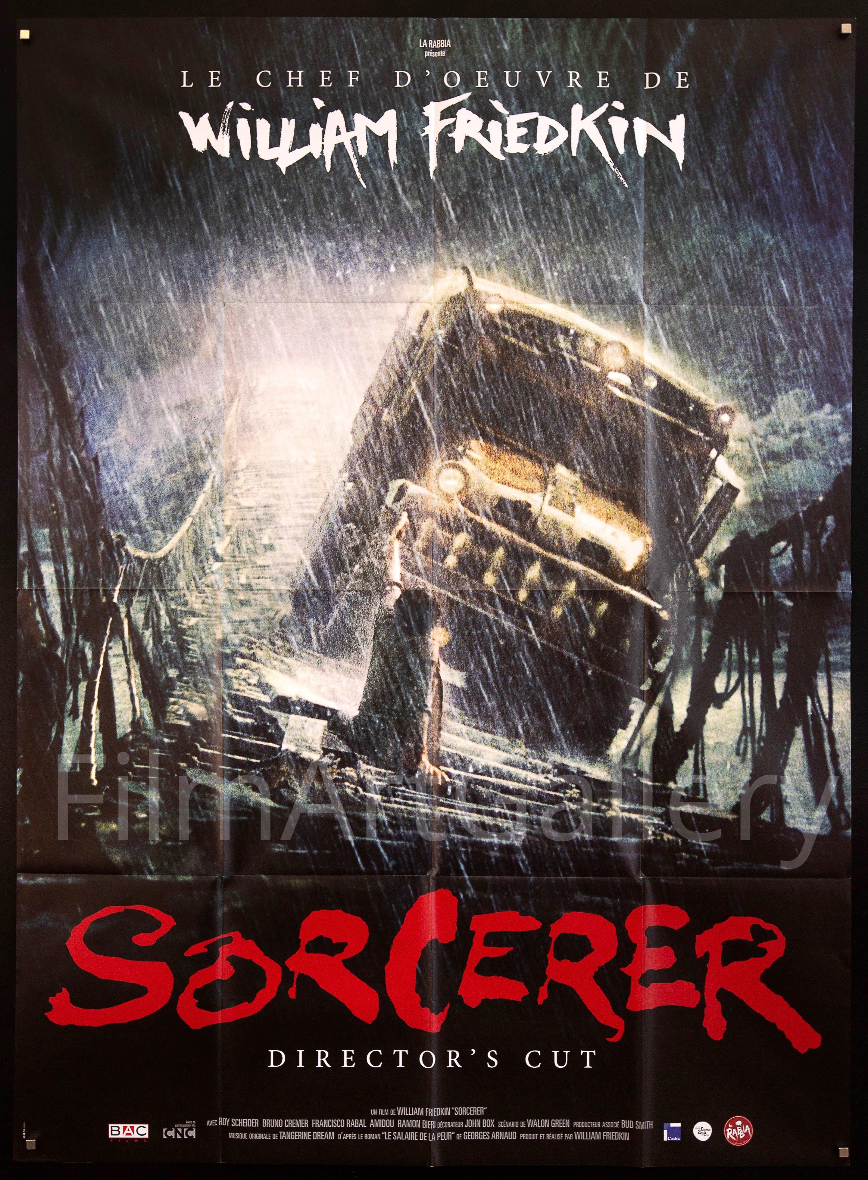
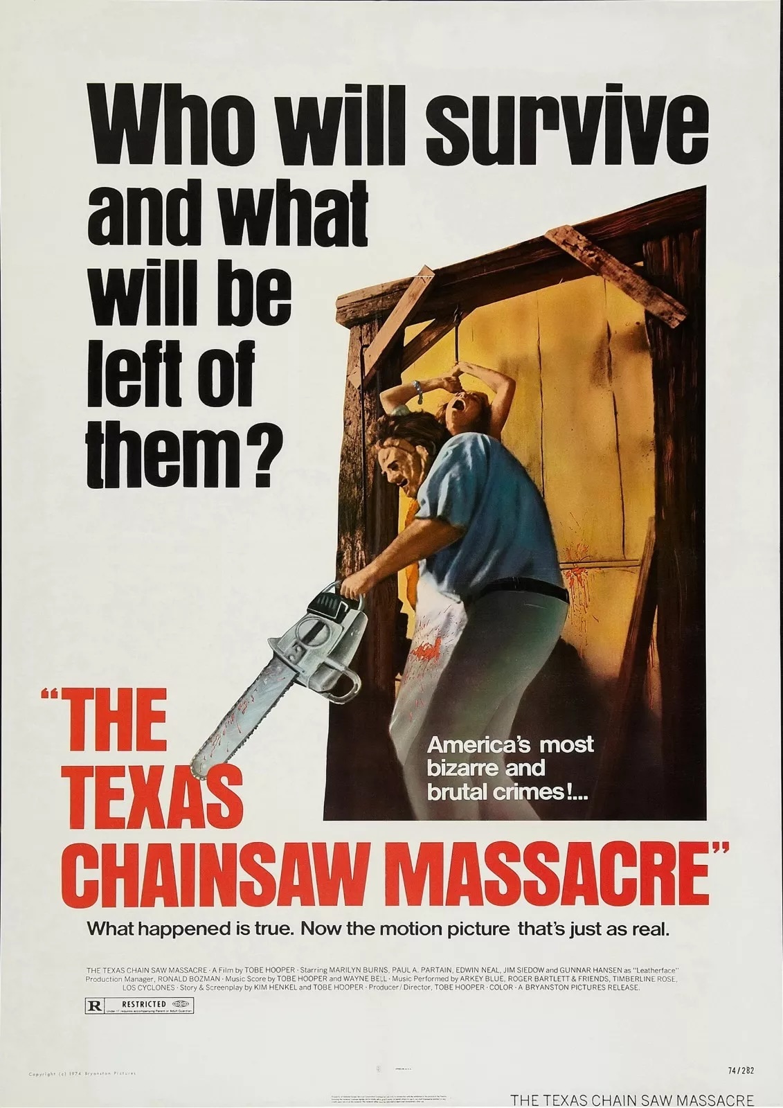
It was great chatting to him about some of the other work they did, including the poster for Sorcerer (and associated Sunset Boulevard billboard complete with swinging rope bridge), The Texas Chainsaw Massacre, and a smattering of other Universal projects. ↩︎
-
Check out some of Larry's work here. ↩︎
-
Unfortunately Jack passed away in 1999. Here's a great tribute piece about him. ↩︎