The lost art of contrast
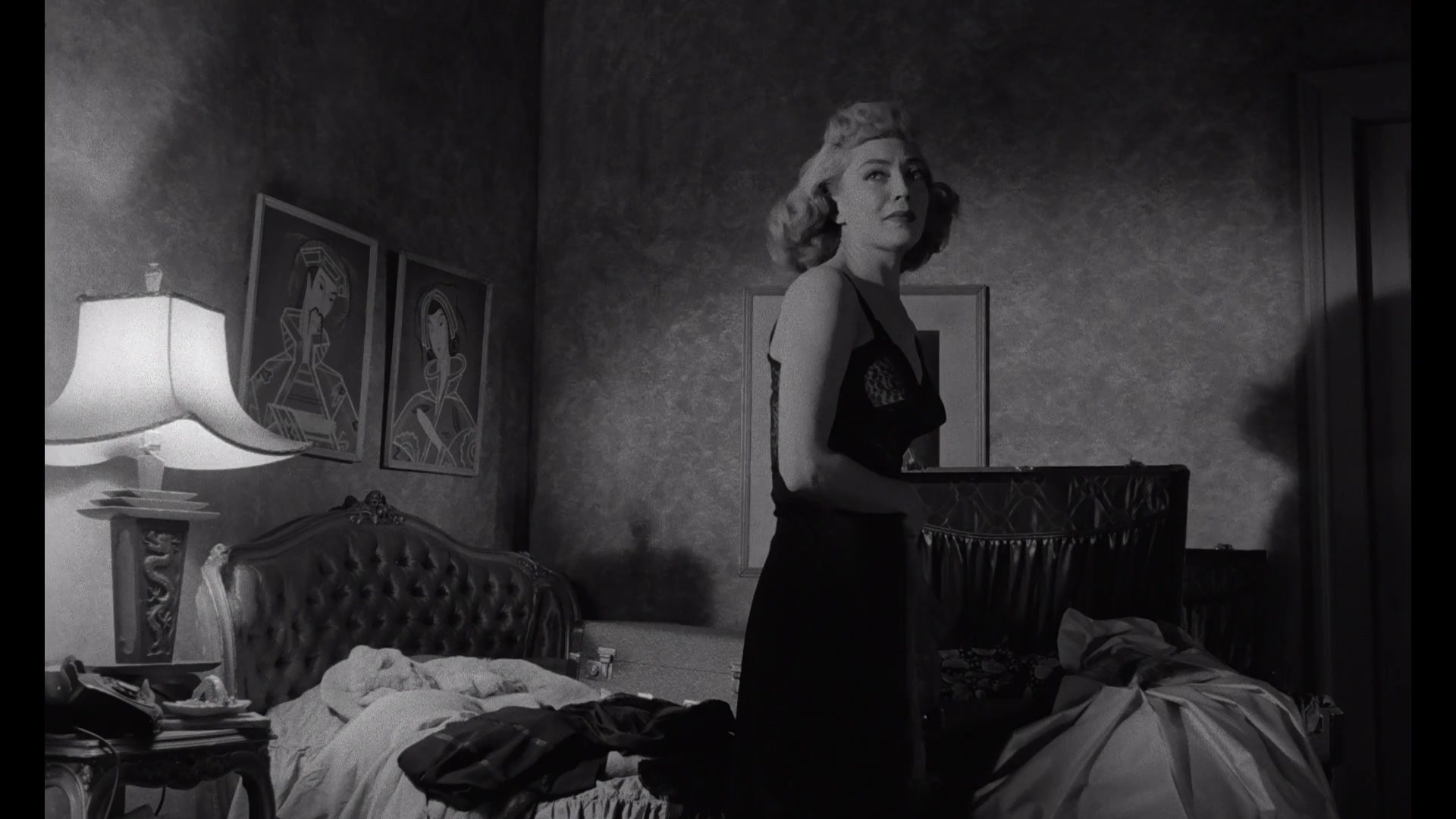
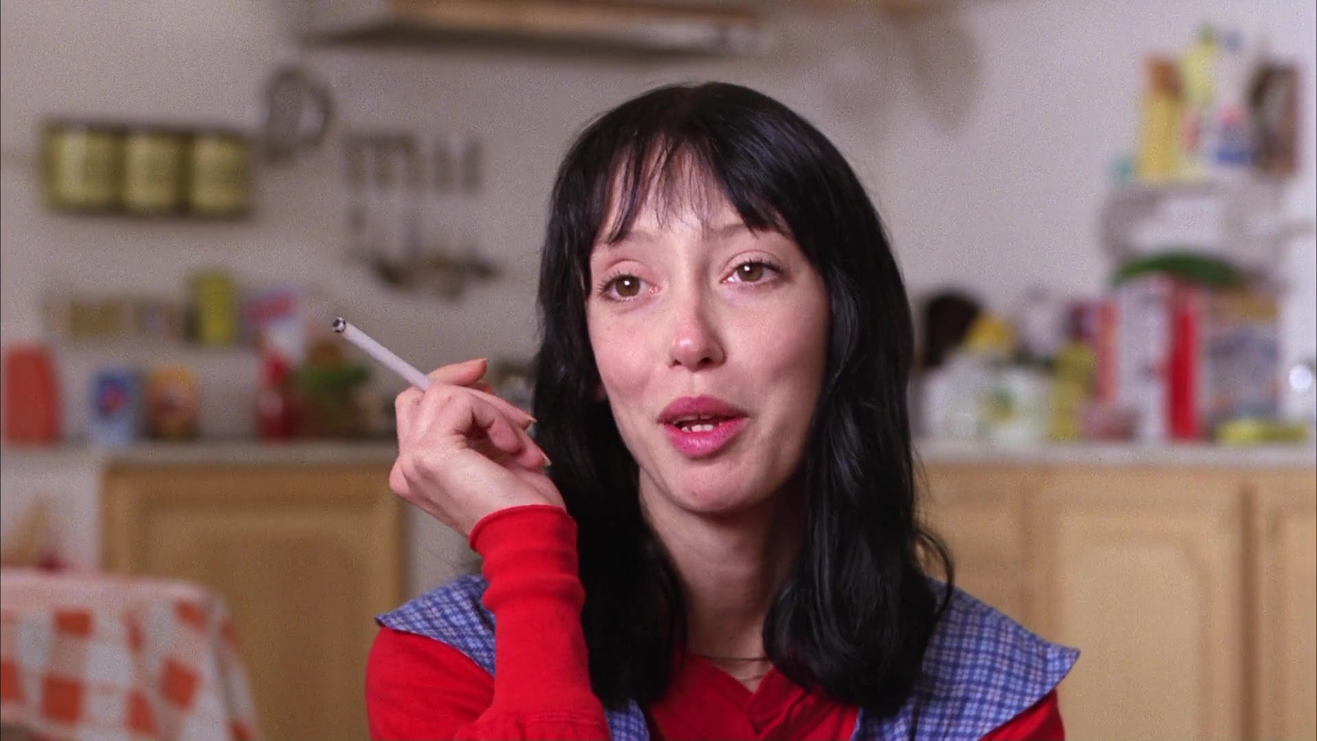
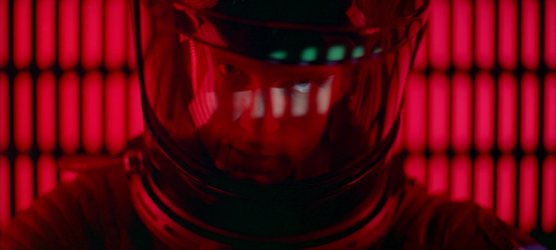
I was watching The Killing the other day, Kubrick's third feature film from 1956. Coming in at just 85 minutes, it’s a lean well-told story of a racetrack heist. But for all of the nonlinear storytelling, and noir aesthetics, and tangled snares of character desires, above all I was just taken with how good it looked.
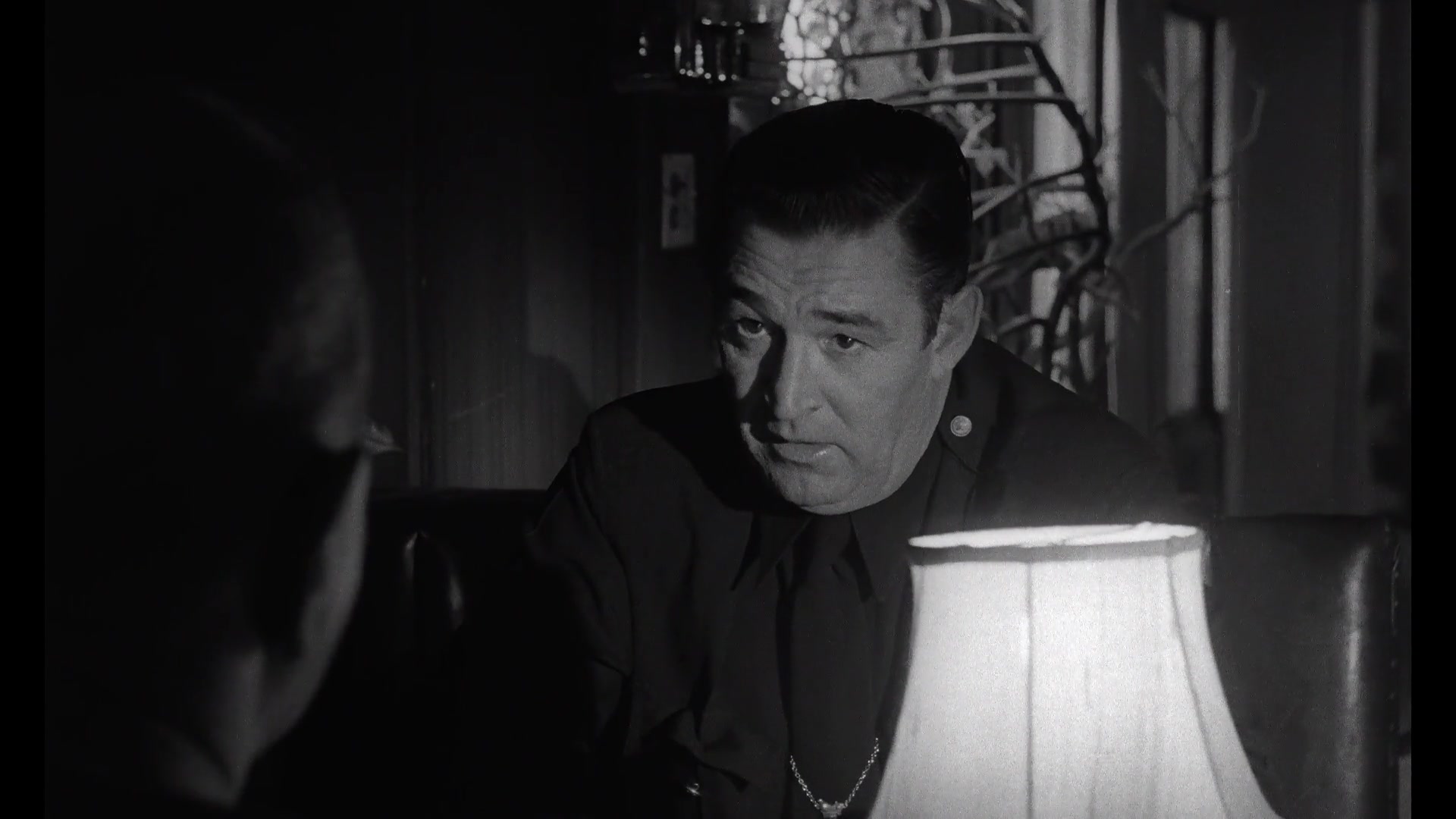
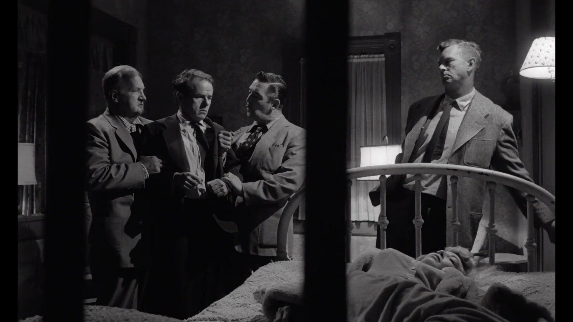
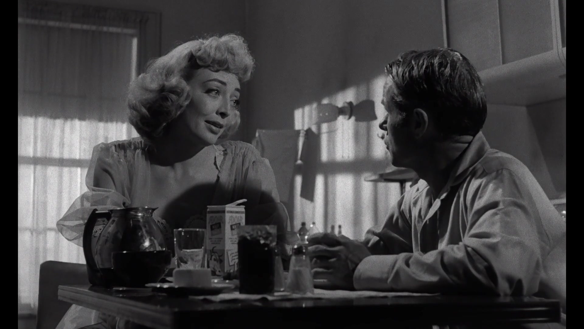
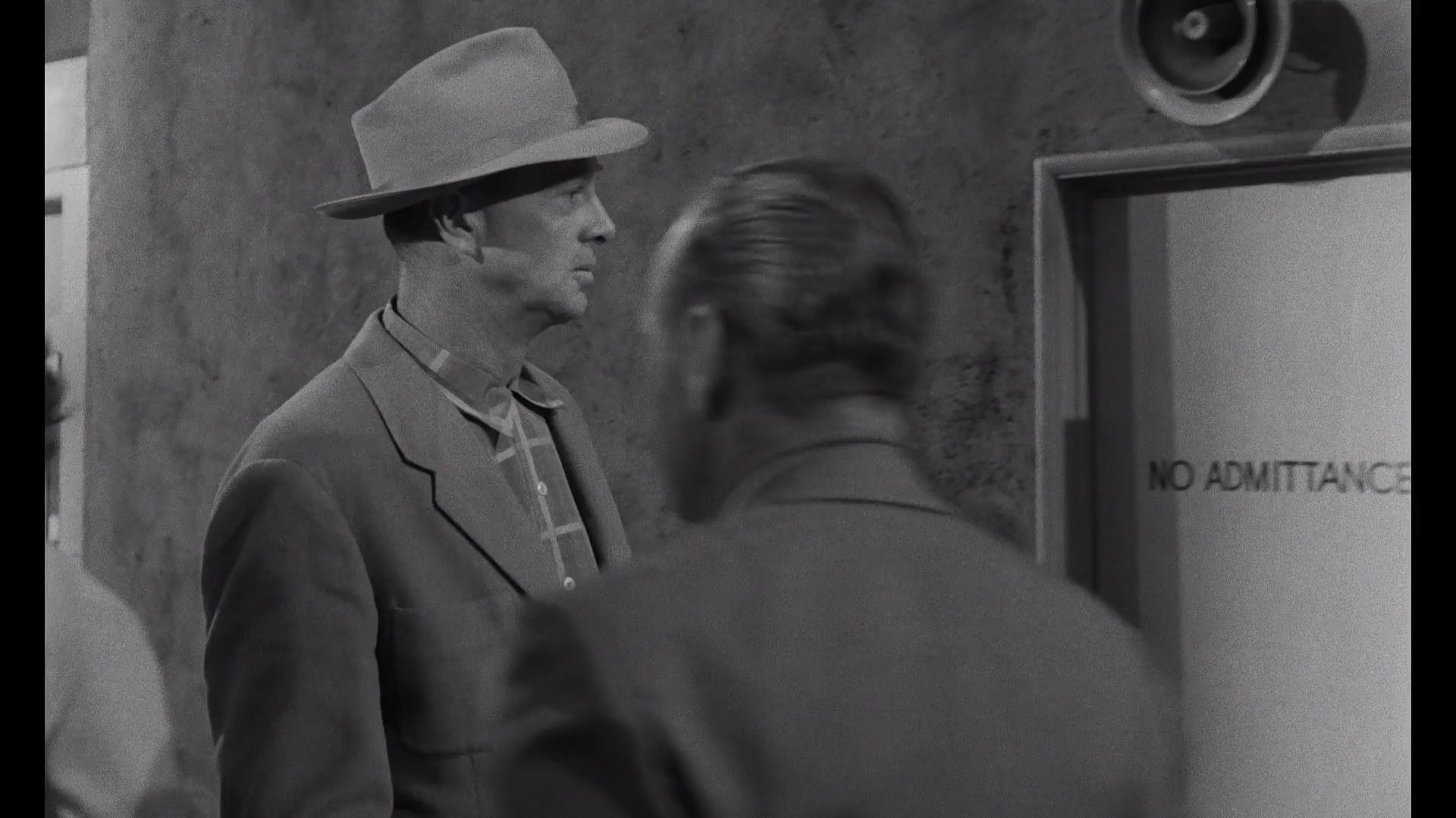
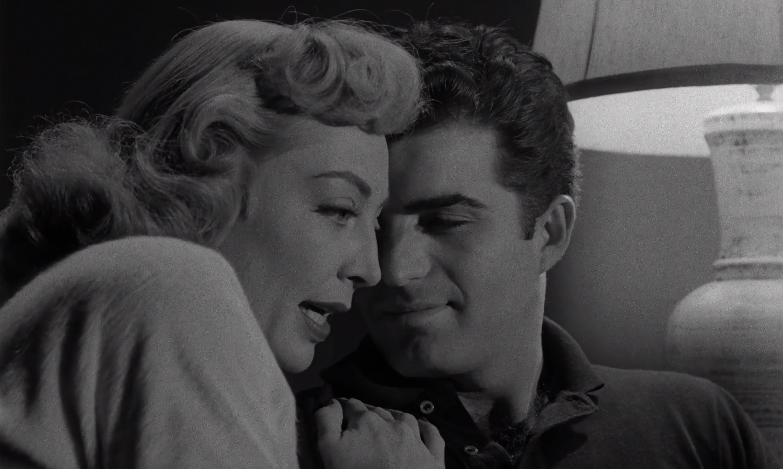
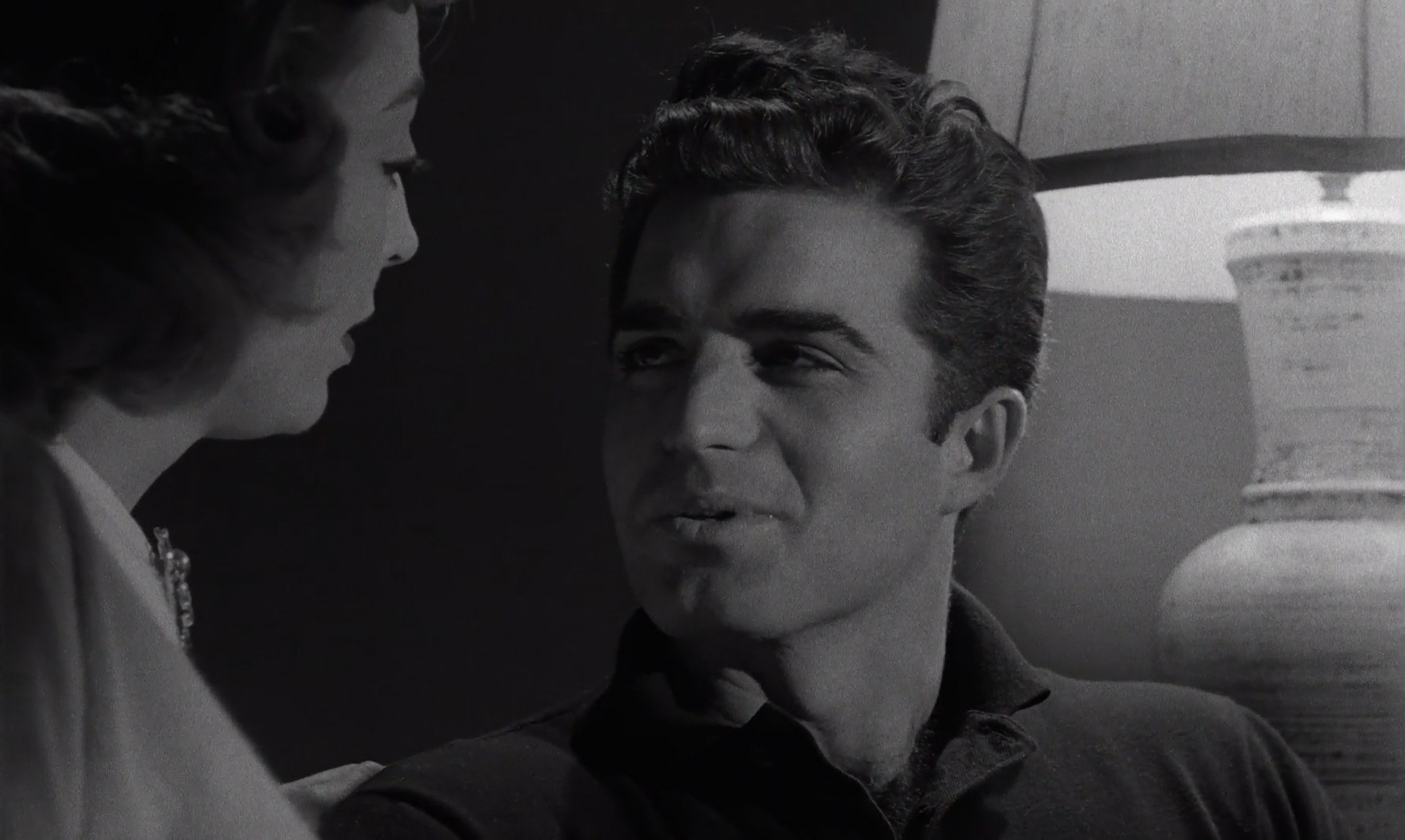
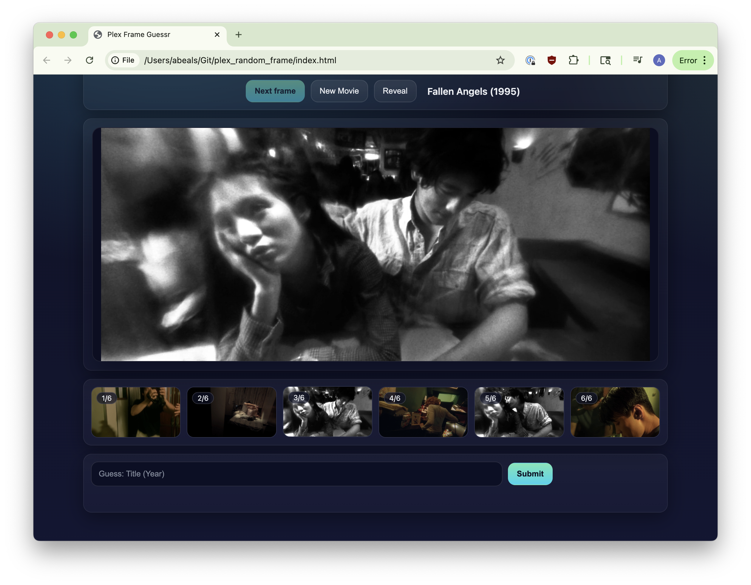
Before I jump into into talking about this, in case you haven't seen it here's 5 random frames (and because you should always take an hour to do a one minute job, here's the software I wrote to pull random frames from a given movie).
1
And then I turned that into a version of https://framed.wtf/ where you guess the movie from your Plex server based off a random frame.
 And then turned that into a web UI for guessing the Harry Potter movie from the audio snippet a la @thesocialgeekfamily.
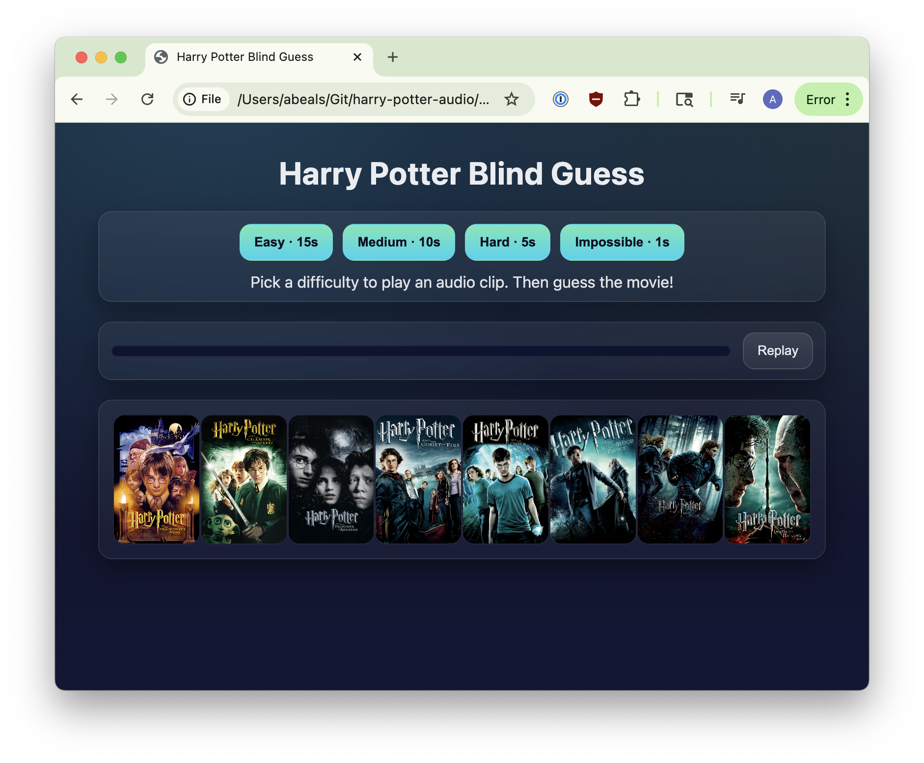 Unfortunately all of these require my private Plex server, so aren't public (hence why they're relegated to a sidenote). You can check out the code for the HP movie guessing game here if you have your own server (or my old book game if not).
You'll notice that for all of these shots, even though some are busy with clutter, your eye is guided perfectly by the light. The blacks and whites and shadows and lights are all designed to draw your eye through the scene: from the lamp to Ted; panning across the room; away from Elisha towards Marie; to the right towards the door; from the bed to Marie. Even from a static frame you have a sense for the focus and composition and where Kubrick wants your eye to go.
Modern movies
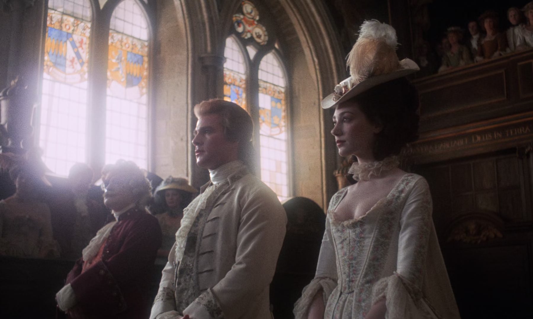
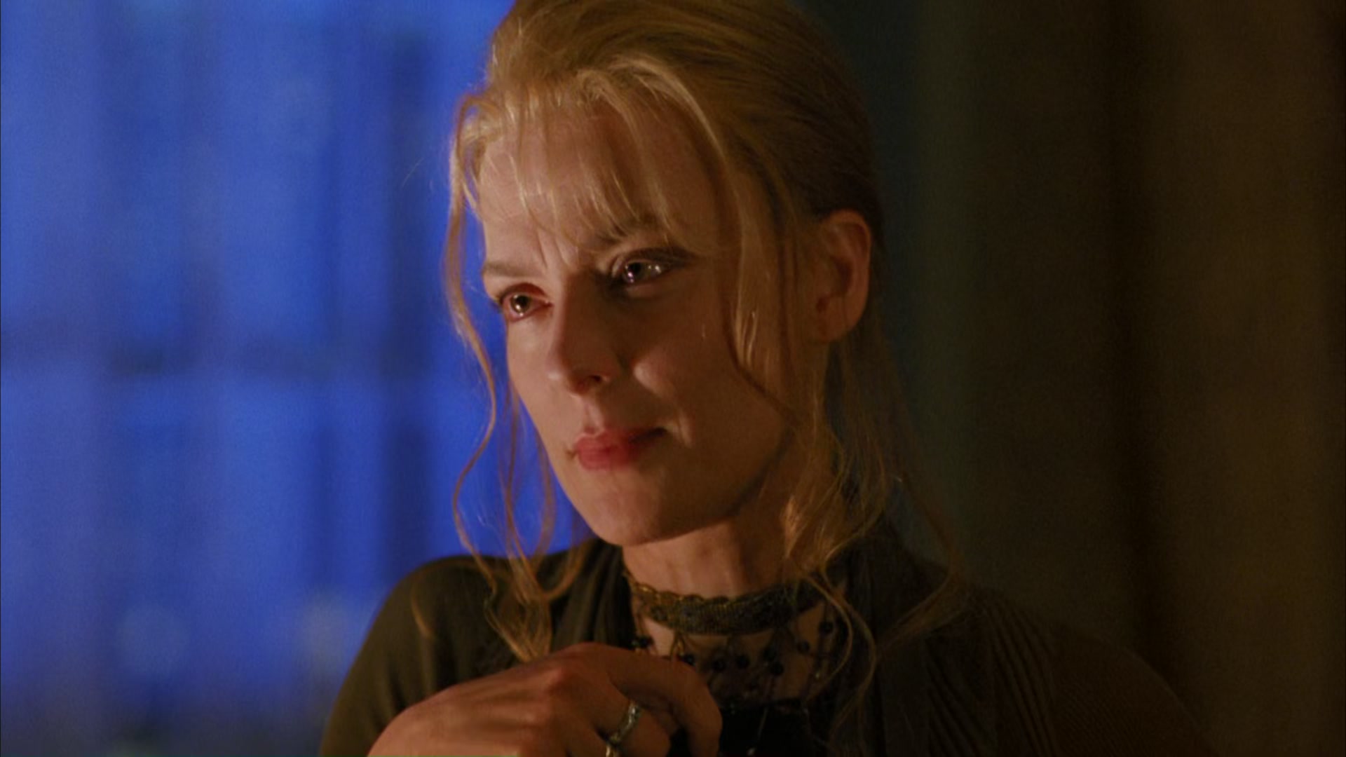
Let's look at a modern movie now. I'm going to be supremely uncharitable and pick Another Simple Favor (2025) (uncharitable in the sense that it premiered on Prime, is not a noir film, Paul Feig is distinctly not Kubrick, and it's very bad). Again, in case you haven't seen it 3 Count yourself lucky. here's 5 random frames.
Rather than guide your eye somewhere, each frame feels flat. Even the shots that could have interesting lighting avoid it: take the first shot for instance, where they're outside and the person she thought might help her is revealing that he's morally bankrupt. You could play this like The Killing does by having Marie's character go from being fully lit at the start to partially in shadow when she starts scheming.
Instead the shot from Another Simple Favor is lit like it's greenscreened despite shooting on location, and the only light source in the scene is actively distracting and in a completely different direction from the fill light on his hair. Or take the fourth frame where she's waking up after being kidnapped in a candle-lit underground holding cell, but it feels like the same lighting as the outdoor wedding.
You could argue that some of this is just the difference between color vs. black and white, but if you you can toggle the images between grayscale and color. It's almost more accentuated in black and white, with a lack of strong contrast and a disconnect between the sources of light and how the characters are lit (and seriously, what the heck is that last shot). But why are these so different?
Black and white movies
Soderbergh has a great edit on his website where he takes Raiders of the Lost Ark and, to emphasize how the movie excels at staging, shot length, and movement, pares it down by removing all color and replacing all sound with Atticus Ross and Trent Reznor's score from The Social Network in lieu of a backing track. 5 The quote of Fincher's that he includes is so damn good: "there’s potentially a hundred different ways to shoot something but at the end of the day there’s really only two, and one of them is wrong." It's a great exercise, and I recommend watching a minute or two of it just to get a feel for it, but you'll quickly realize something that Soderbergh also calls out:
"At some point you will say to yourself or someone THIS LOOKS AMAZING IN BLACK AND WHITE and it’s because Douglas Slocombe shot THE LAVENDER HILL MOB and the THE SERVANT and his stark, high-contrast lighting style was eye-popping regardless of medium."
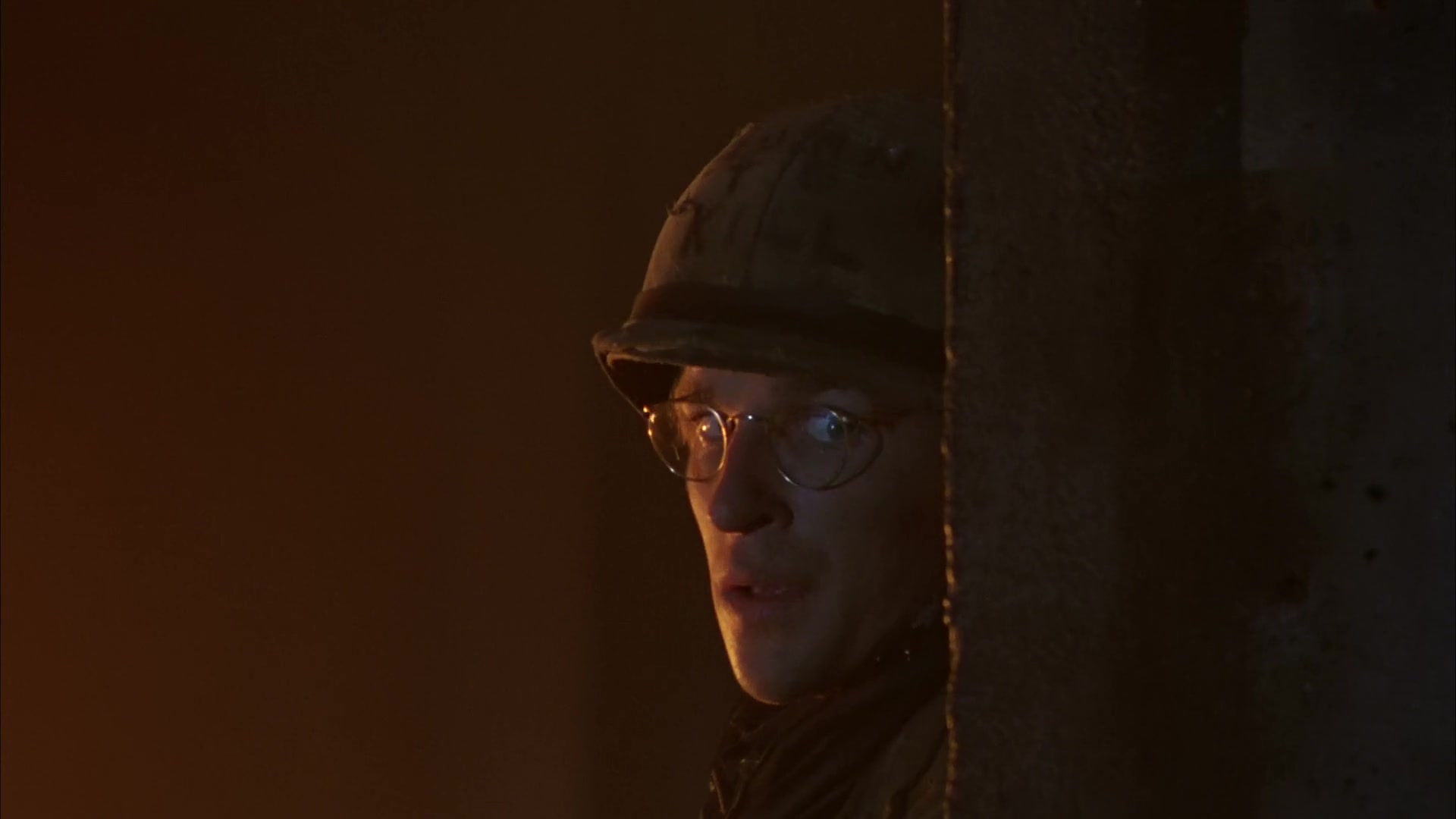
Again, here's five random shots, and again you can to toggle grayscale.
What are the two movies that Slocombe also did cinematography for that Soderbergh references? The Lavender Hill Mob and The Servant, two black and white movies from 1951 and 1963 respectively.
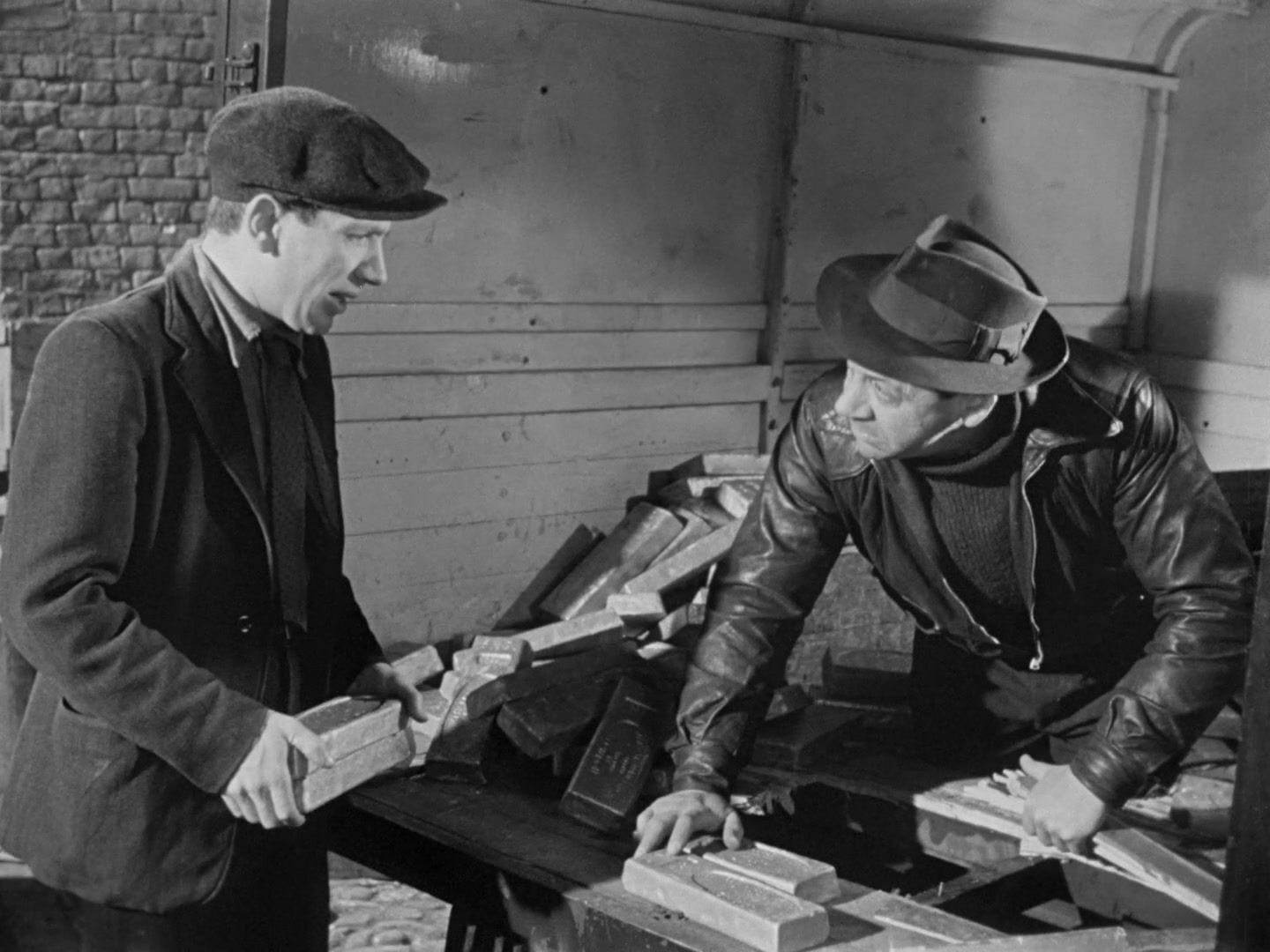 The Lavender Hill Mob (1951)
 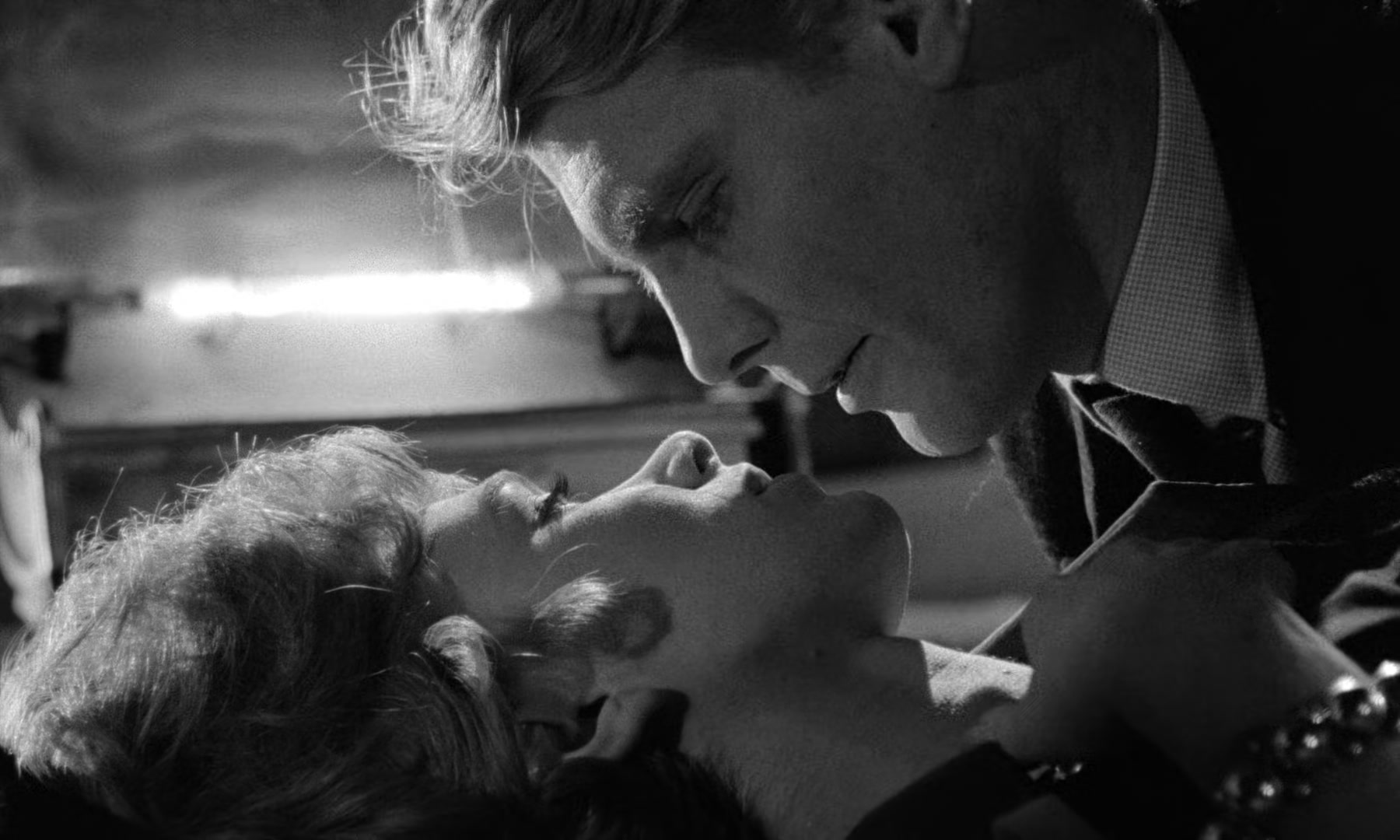 The Servant (1963)
And here's where we get to why I think modern movies have bad lighting and bad contrast: the cinematographers who make them have no longer worked on or grown up with black and white movies.
Color films over time
We can track down when that transition happened. The Servant was in black and white and released in 1963, but obviously there are color movies by that point (Hitchcock's The Birds comes out the same year in color, and stuff like The Wizard of Oz had been using Technicolor's three-color system 6 The three-color system also goes by Process 4, funnily enough. This was created back in 1932, though Technicolor's monopolistic high equipment rental costs combined with the Depression ended up slowing adoption until the late 30s. since the 30s). So when did color movies start taking off?
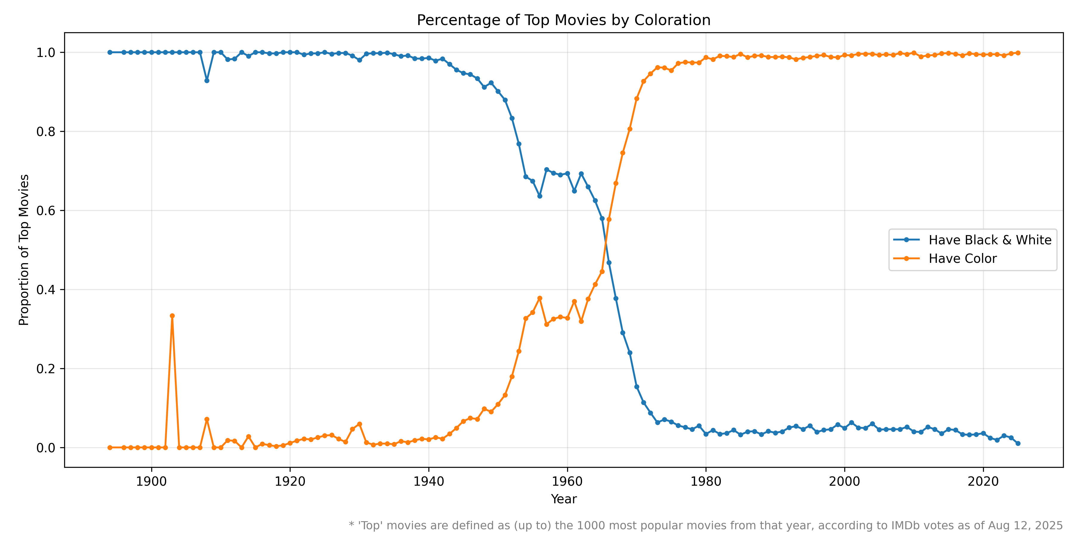
I went looking for a graph of percentage of films in color versus in black and white and could only really find one source, a blog post from Stephen Follows. But while he said that his dataset was composed of "377,967 feature films, released between 1900 and 2023" there wasn't an attached data source to verify. So I recreated it! IMDb has a full data dump of their movies and ratings, and while it doesn't have coloration information their app surfaces it. We can extract the GraphQL query that the app uses
7
Check out this writeup if you want to see how to do this with mitmproxy, but it would feel duplicative as a blog post so this is all you're getting! If you're curious, you can see the specific chunk of code here and searching for https://caching.graphql.imdb.com/ on GitHub will bring up a lot of other instances of people using it as an unofficial API.
and replay it to query the coloration info for the 1000 most popular movies for each year (as ranked by the number of IMDb votes).
As you can see from the graph, color movies don't get above 5% until 1945, 8 Other than a big spike in 1903. This is because there were only 3 movies that year, and one of them was The Life and Passion of Jesus Christ, the first feature-length narrative film, and colorized using Pathécolor, a hand-drawn stencil technique. and after a relatively stable split of 70/30 from 1954 to 1965 they finally surpass black and white in 1966 and never look back. 9 This conflicts slightly with Stephen's answer of 1967. This is potentially just due to my restriction of "top" truncating the list down to 101,104 feature films, or something about his filtering process. Regardless, close enough. By 1976 black and white movies were under 5%, though it's hovered around that number ever since thanks to stuff like The Girl with the Needle (2024) and Oppenheimer (2023). 10 The data sums to more than 100% because of movies like Oppenheimer that have both color and black and white sequences. If you were born after that point you're much less likely to have grown up watching them, or shooting them when starting your career, and this has an impact on how your lighting is designed and shots are composed. You can bear this out by looking at a list like IndieWire's 25 best cinematographers of the 21st century—19 are born before 1968, and 5 of the remaining 6 11 Shoutout Rachel Morrison for being the exception that proves the rule. have had notable black and white releases within their career. 12 Obviously there are a lot of other things contributing to this: you're not going to end up on a 'best of' list without being older and having a larger body of work. I still think it stands.
Caveats galore
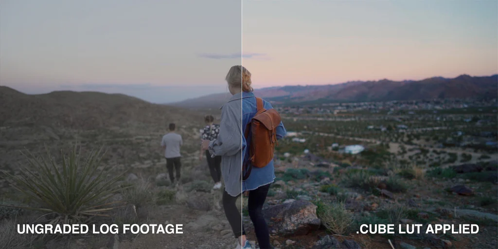
To be clear, this is not the only reason. Modern cinematographers are still going through film school and watching black and white movies and learning good lighting techniques. Additionally most movies aren't noir films, most cinematographers aren't Roger Deakins or Lucien Ballard, and most movies aren't helmed by Stanley Kubrick. Futhermore there are lots of other factors pushing towards flat or poorly contrasted images, such as the shift to digital, subconscious anchoring on flat ungraded LOG footage, 13 Shooting in this format gives high dynamic and tonal range allowing you to post-process the footage with more control, but defaults to a washed-out appearance until that processing happens. just generally poor color grading, and trends towards minimalist lighting.
But maybe the next time you're watching a movie and the lighting feels off and there's no contrast, put on something shot by someone born before the 70s and revel in it.
-
And then I turned that into a version of https://framed.wtf/ where you guess the movie from your Plex server based off a random frame.
 And then turned that into a web UI for guessing the Harry Potter movie from the audio snippet a la @thesocialgeekfamily.
 Unfortunately all of these require my private Plex server, so aren't public (hence why they're relegated to a sidenote). You can check out the code for the HP movie guessing game here if you have your own server (or my old book game if not). ↩︎
 -
Marie Windsor and Elisha Cook Jr.'s dynamic is impossible to take your eyes off: they both play it perfectly. And the way they're framed and blocked! *chefs kiss* ↩︎
-
Count yourself lucky. ↩︎
-
Really wish he stayed locked away in the 365 Days cinematic universe. ↩︎
-
The quote of Fincher's that he includes is so damn good: "there’s potentially a hundred different ways to shoot something but at the end of the day there’s really only two, and one of them is wrong." ↩︎
-
The three-color system also goes by Process 4, funnily enough. This was created back in 1932, though Technicolor's monopolistic high equipment rental costs combined with the Depression ended up slowing adoption until the late 30s. ↩︎
-
Check out this writeup if you want to see how to do this with
mitmproxy, but it would feel duplicative as a blog post so this is all you're getting! If you're curious, you can see the specific chunk of code here and searching forhttps://caching.graphql.imdb.com/on GitHub will bring up a lot of other instances of people using it as an unofficial API. ↩︎ -
Other than a big spike in 1903. This is because there were only 3 movies that year, and one of them was The Life and Passion of Jesus Christ, the first feature-length narrative film, and colorized using Pathécolor, a hand-drawn stencil technique. ↩︎
-
This conflicts slightly with Stephen's answer of 1967. This is potentially just due to my restriction of "top" truncating the list down to 101,104 feature films, or something about his filtering process. Regardless, close enough. ↩︎
-
The data sums to more than 100% because of movies like Oppenheimer that have both color and black and white sequences. ↩︎
-
Shoutout Rachel Morrison for being the exception that proves the rule. ↩︎
-
Obviously there are a lot of other things contributing to this: you're not going to end up on a 'best of' list without being older and having a larger body of work. I still think it stands. ↩︎
-
Shooting in this format gives high dynamic and tonal range allowing you to post-process the footage with more control, but defaults to a washed-out appearance until that processing happens. ↩︎
