Dartmouth Room Search - Visuals
I quickly did some visuals, and ended up with this 'passable' work:
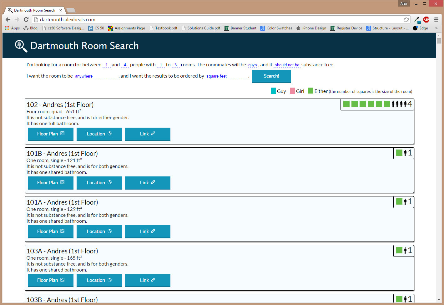 It worked, to be sure...but it didn't look GOOD. The first major problem was the color scheme. I'm not sure why I went with the blue, but I realized that I probably should have gone with Dartmouth colors. I went to the Dartmouth website, and took the main color. It looks like this: . Now I need a color palette. First off, this site details the process of generating shades of the color you have (note 20% grey = 10% black). I also needed a complementary color, and from the same website observed this link to making a color palette. It utilizes a program called ColorScheme Studio, the free trial version can be downloaded from online. To activate it, you can (hypothetically) use the information located here. I fully support buying it, however.
This can be used to find the complementary colors, as a highlight. Then applying the tinting creates this palette that I'm going to use to color it:
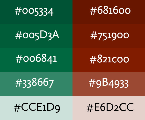
I'm also using #F2F7F5, which is 95% white as a very light green background and #FBF8F7, a very light red one.
The first thing I did was re-do all of the random blues over to the correct colors. I did the search section in the reds to make it separate from the rest of the information. I redid a lot of the width stuff so that it look nicer on mobile and takes up more of the screen. I changed the colors of the room icons as well, setting them to the complementary colors with a 60% white layer. I added title-text to the top section of the rooms, and removed the help section. The finished product looks like this:
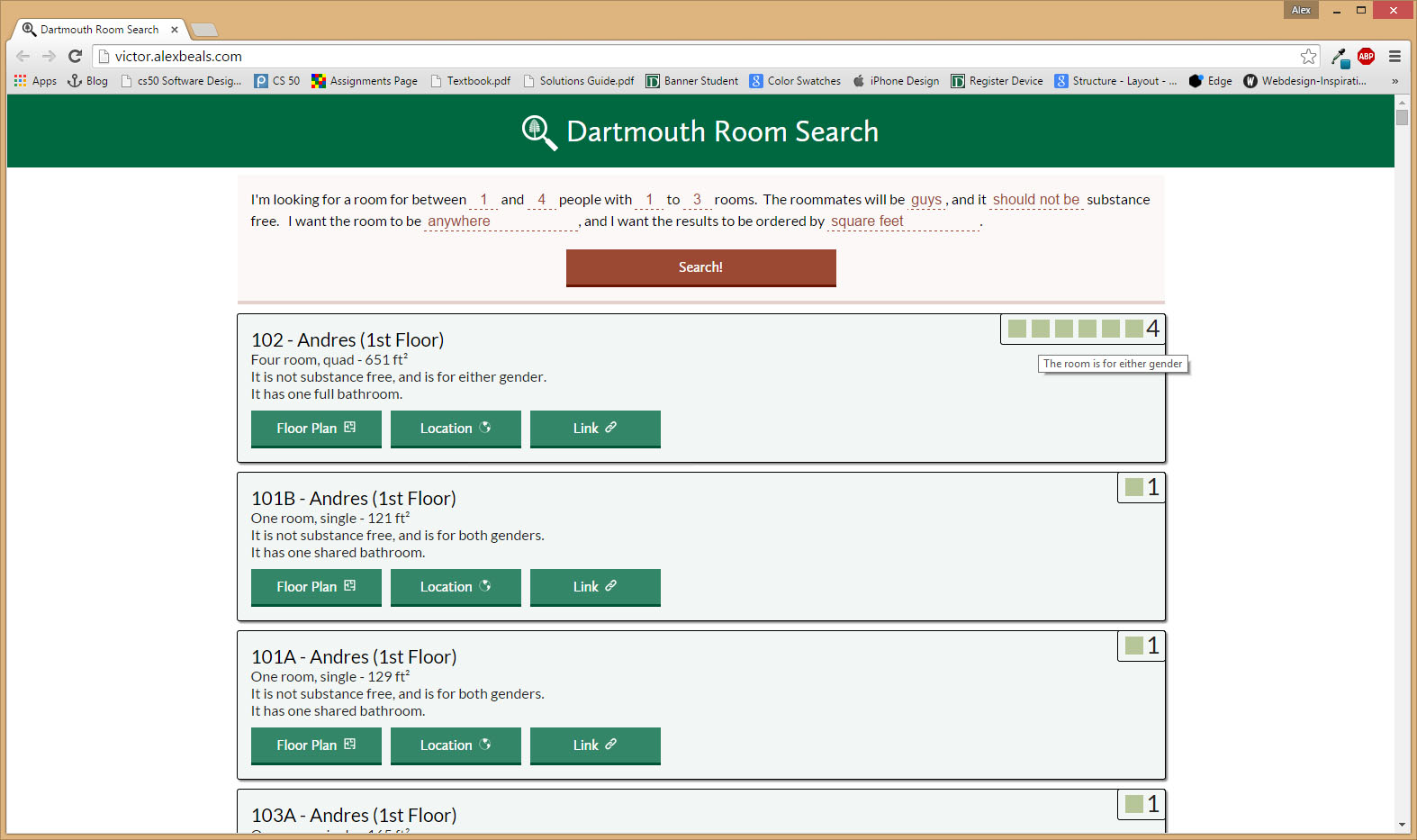
I pushed the footer so that it stays at the bottom, and for now it's done! I might look into some other features, such as roommate finding (a way to find other people that don't have roommates, etc.), ranking (what order it went last year), and sorting by distance (to foco, gym, LSC, or maybe any point you choose with Google Maps).