Dartmouth Banner Redesign - Part 1 (The Problems)
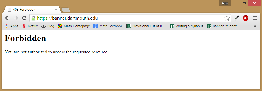
Dartmouth currently uses an Ellucian product called Banner for the 'Student Information System'. From a UI standpoint, it's a nightmare. From a UX standpoint, it's even worse. First of all, the URL. The URL to access banner is https://banner.dartmouth.edu/banner/groucho/twbkwbis.P_WWWLoginWEBAUTH. One would think that https://banner.dartmouth.edu would redirect, and be a lot easier. But instead, that redirects to a 403 Forbidden page.
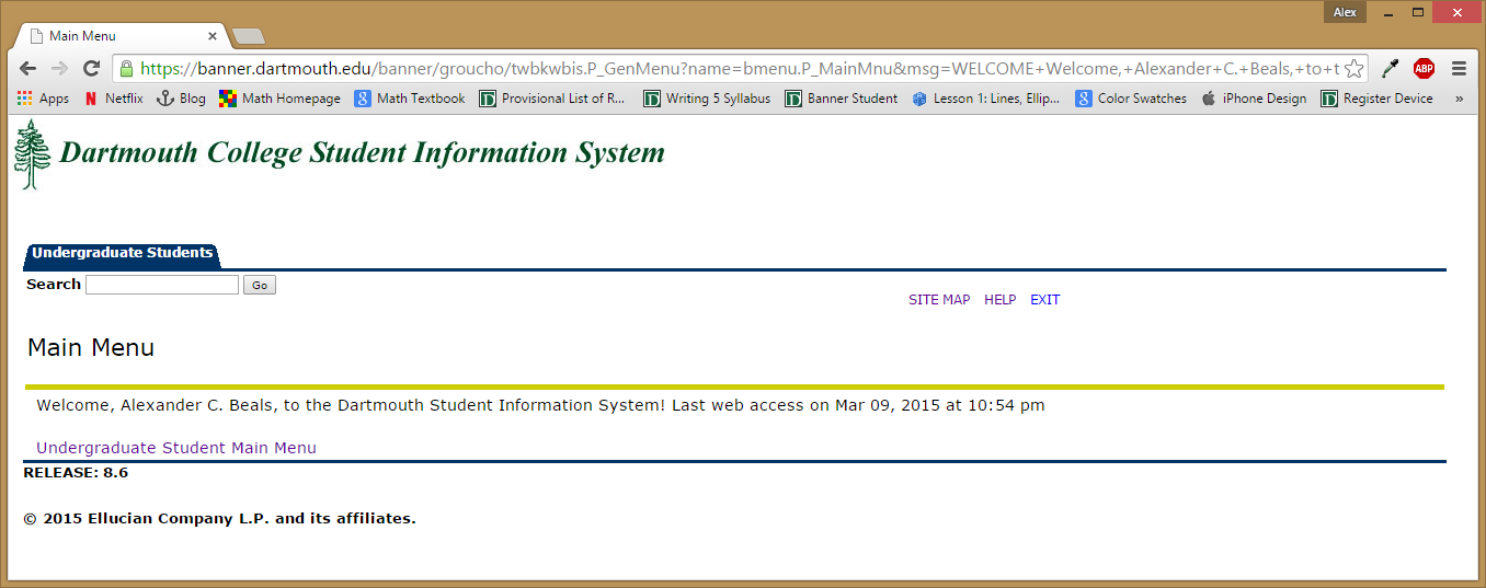
 When you finally get to the site, you're greeted with this 'beautiful' and totally useful landing page.
 The 'Help' link brings up a popup window that just says click on the Menu. The 'Site Map' link brings up the same menu options as clicking 'Undergraduate Student Main Menu'. Clicking that brings up one of the worst menus.
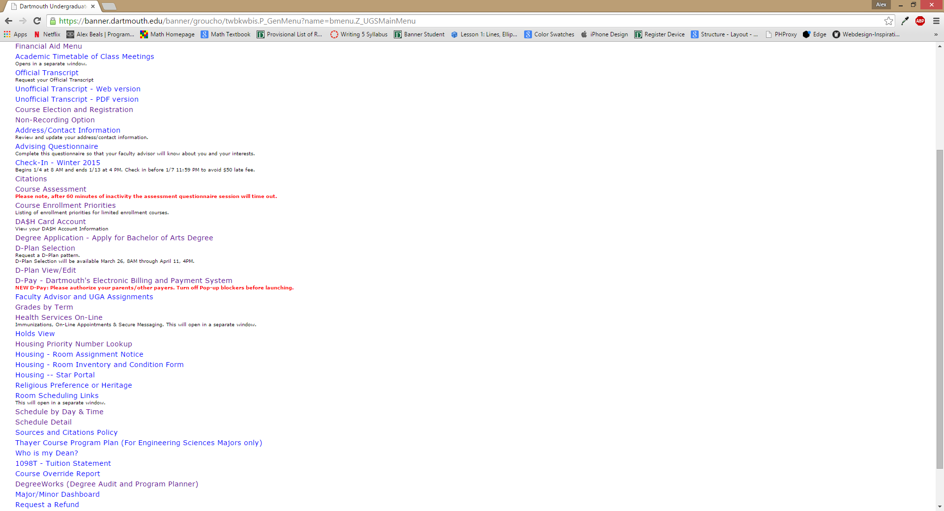 You'll notice that the links are almost in alphabetical order, which is infuriating. Now, a lot of these links aren't applicable, or available at certain times. The main ones are the following:
- Non-recording Option - If the deadline has passed, it won't let you choose a non-recording option. This doesn't need to be available all the time.
- Advising Questionaire - Once this has been filled out, it is of absolutely no use to anyone, and it's locked for some bizarre reason.
- Check-in - Once you have checked in, this both isn't applicable and isn't accessible.
- Citations - If you have no citations, this is blank. Obviously.
- Course Assessment - This is an option even if they have been filled out or aren't available. This is useless.
- Degree Application - Apply for Bachelors of Arts Degree - This is only available in your graduating year. Why is this an option for me.
- D-Plan Selection - This is also available even when you can't set the D-Plan.
- Holds View - This is an option even if you don't have any Holds
- Housing Priority Number Lookup - This is an option even if housing numbers haven't been released.
- Room Inventory and Condition Form - This is an option even after it's filled out.
- Housing-Star Portal - Redirects to some bizarre page who's only function appears to fill out your housing application and get the results. Why is this on an external site?
- Sources and Citations Policy - After you agree to this, this doesn't really need it's own link, it just needs to be accessible.
- Thayer Course Program Plan - This specifies that it's for Engineering students only. I'm not. Why is this on the page at all.
- Who is my Dean? - Why is this not under Faculty Advisor and UGA Assignments. Just have a mentors category.
- DegreeWorks - Really should be integrated, but let's just avoid that for now.
- Minor/Major Dashboard - I can't even declare a major at this point. Why is this available.
- Verify Your Enrollment - This shouldn't be an option after you verify.
All of the other links have some major UI or UX problem. There's not really a single well-designed element. Most of all, however, the problem is the organization. These elements shouldn't be sorted alphabetically, they should be organized by the topic. There should be an option to switch between the list view, and some sort of categorical dropdown. There should be links that appear only when they're useful. And overall, it should look like it was developed this decade.